12. Customizing Volto Components#
In this part you will:
Find out how news items are displayed
Customize existing components
Topics covered:
Customize existing views with Component Shadowing
Content Type Views
Listing Views
Blocks
12.1. Component shadowing#
We use a technique called component shadowing to override an existing Volto component with our local custom version, without having to modify Volto's source code at all.
You have to place the replacing component in the same original folder path inside the src/customizations folder of your app.
Every time you add a file to the customizations folder or to the theme folder, you must restart Volto for changes to take effect. From that point on, the hot reloading should kick in and reload the page automatically on changes.
You can customize any module in Volto, including actions and reducers, not only components.
The Volto code can be found in /omelette/.
12.2. The Logo#
You can use this approach to change the Logo.
Create your own logo as a svg image or download a logo and add it to your Volto app (frontend) using this path and name: src/customizations/components/theme/Logo/Logo.svg.
After a restart of Volto (ctrl + c and yarn start) your page should look like this:
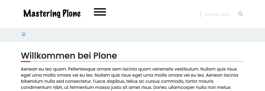
12.4. The News Item View#
We want to show the date a News Item is published. This way visitors can see at a glance if they are looking at current or old news.
This information is not shown by default. So you need to customize the way a News Item is rendered.
The Volto component to render a News Item is in /omelette/src/components/theme/View/NewsItemView.jsx.
 1/**
 2 * NewsItemView view component.
 3 * @module components/theme/View/NewsItemView
 4 */
 5
 6import React from 'react';
 7import PropTypes from 'prop-types';
 8import { Container, Image } from 'semantic-ui-react';
 9import {
10  hasBlocksData,
11  flattenToAppURL,
12  flattenHTMLToAppURL,
13} from '@plone/volto/helpers';
14import RenderBlocks from '@plone/volto/components/theme/View/RenderBlocks';
15
16/**
17 * NewsItemView view component class.
18 * @function NewsItemView
19 * @params {object} content Content object.
20 * @returns {string} Markup of the component.
21 */
22const NewsItemView = ({ content }) =>
23  hasBlocksData(content) ? (
24    <div id="page-document" className="ui container viewwrapper event-view">
25      <RenderBlocks content={content} />
26    </div>
27  ) : (
28    <Container className="view-wrapper">
29      {content.title && (
30        <h1 className="documentFirstHeading">
31          {content.title}
32          {content.subtitle && ` - ${content.subtitle}`}
33        </h1>
34      )}
35      {content.description && (
36        <p className="documentDescription">{content.description}</p>
37      )}
38      {content.image && (
39        <Image
40          className="documentImage"
41          alt={content.title}
42          title={content.title}
43          src={
44            content.image['content-type'] === 'image/svg+xml'
45              ? flattenToAppURL(content.image.download)
46              : flattenToAppURL(content.image.scales.mini.download)
47          }
48          floated="right"
49        />
50      )}
51      {content.text && (
52        <div
53          dangerouslySetInnerHTML={{
54            __html: flattenHTMLToAppURL(content.text.data),
55          }}
56        />
57      )}
58    </Container>
59  );
60
61/**
62 * Property types.
63 * @property {Object} propTypes Property types.
64 * @static
65 */
66NewsItemView.propTypes = {
67  content: PropTypes.shape({
68    title: PropTypes.string,
69    description: PropTypes.string,
70    text: PropTypes.shape({
71      data: PropTypes.string,
72    }),
73  }).isRequired,
74};
75
76export default NewsItemView;
Note
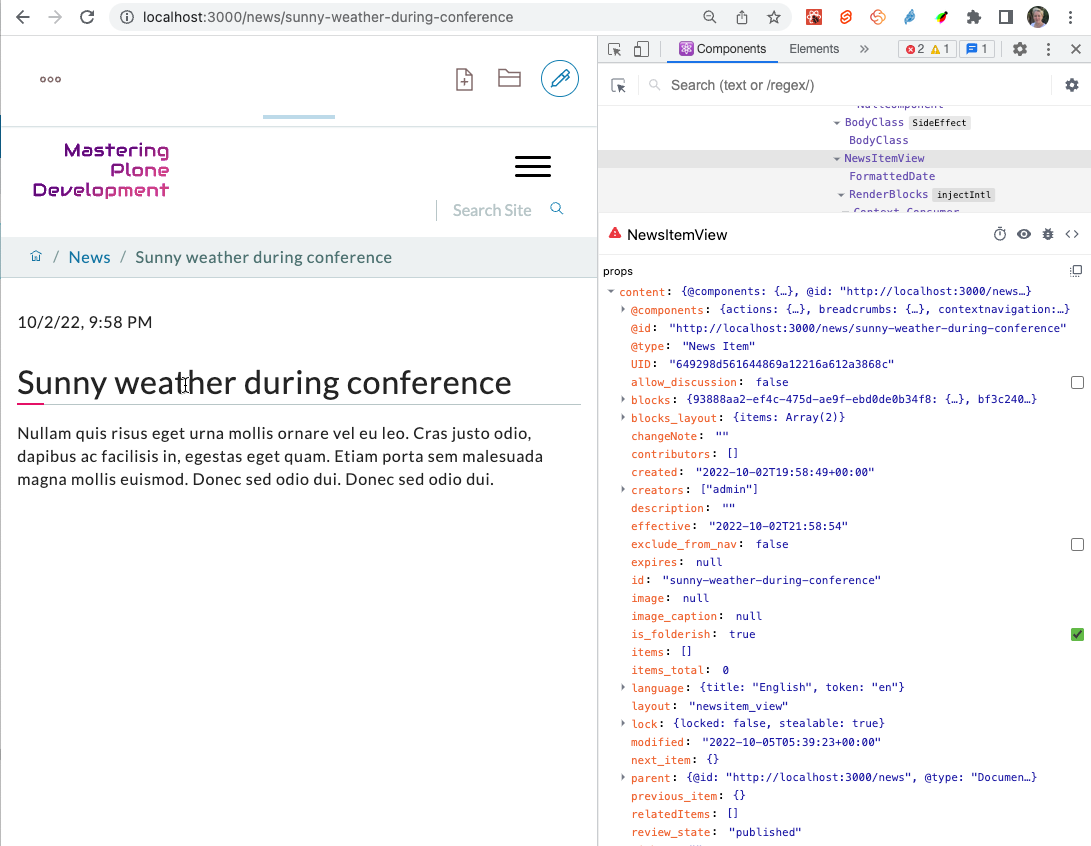
contentis passed toNewsItemViewand represents the content item as it is serialized by the REST API.The view displays various attributes of the News Item using
content.title,content.descriptionorcontent.text.dataYou can inspect all data that
contentholds using the React Developer Tools for Firefox or Chrome:
Copy that file into src/customizations/components/theme/View/NewsItemView.jsx.
After restarting Volto, the new file is used when displaying a News Item.
To make sure your file is used, add a small change before the blocks <RenderBlocks content={content} />.
If it shows up you're good to go.
Tip
In you own projects you should always do a commit of the unchanged file and another commit after you changed the file. This way you will have a commit in your git history with the change you made. You will thank yourself later for that clean diff!
To display the date add the following before the text:
<p>{content.created}</p>
This will render something like 2022-10-02T21:58:54. Not very user friendly. Let's use one of many helpers available in Volto.
Import the component FormattedDate from @plone/volto/components at the top of the file and use it to format the date in a readable format.
 1/**
 2 * NewsItemView view component.
 3 * @module components/theme/View/NewsItemView
 4 */
 5
 6import React from 'react';
 7import PropTypes from 'prop-types';
 8import { Container, Image } from 'semantic-ui-react';
 9import {
10  hasBlocksData,
11  flattenToAppURL,
12  flattenHTMLToAppURL,
13} from '@plone/volto/helpers';
14import { FormattedDate } from '@plone/volto/components';
15import RenderBlocks from '@plone/volto/components/theme/View/RenderBlocks';
16
17/**
18 * NewsItemView view component class.
19 * @function NewsItemView
20 * @params {object} content Content object.
21 * @returns {string} Markup of the component.
22 */
23const NewsItemView = ({ content }) =>
24  hasBlocksData(content) ? (
25    <div id="page-document" className="ui container viewwrapper event-view">
26      <p>
27        <FormattedDate date={content.created} includeTime />
28      </p>
29      <RenderBlocks content={content} />
30    </div>
31  ) : (
32    <Container className="view-wrapper">
33      {content.title && (
34        <h1 className="documentFirstHeading">
35          {content.title}
36          {content.subtitle && ` - ${content.subtitle}`}
37        </h1>
38      )}
39      {content.description && (
40        <p className="documentDescription">{content.description}</p>
41      )}
42      {content.image && (
43        <Image
44          className="documentImage"
45          alt={content.title}
46          title={content.title}
47          src={
48            content.image['content-type'] === 'image/svg+xml'
49              ? flattenToAppURL(content.image.download)
50              : flattenToAppURL(content.image.scales.mini.download)
51          }
52          floated="right"
53        />
54      )}
55      {content.text && (
56        <div
57          dangerouslySetInnerHTML={{
58            __html: flattenHTMLToAppURL(content.text.data),
59          }}
60        />
61      )}
62    </Container>
63  );
64
65/**
66 * Property types.
67 * @property {Object} propTypes Property types.
68 * @static
69 */
70NewsItemView.propTypes = {
71  content: PropTypes.shape({
72    title: PropTypes.string,
73    description: PropTypes.string,
74    text: PropTypes.shape({
75      data: PropTypes.string,
76    }),
77  }).isRequired,
78};
79
80export default NewsItemView;
The result should look like this:
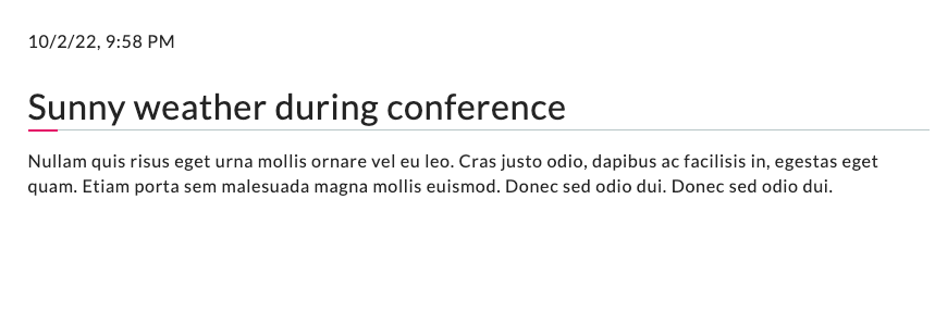
Now another issue appears. There are various dates associated with any content object:
The date the item is created:
content.createdThe date the item is last modified
content.modifiedThe date the item is published
content.effective
In fact you most likely want to show the date when the item was published. But while the item is not yet published, that value is not yet set and you will get a error. So we'll add some simple logic to use the effective date only if it exists.
{content.review_state === 'published' && content.effective && (
  <p>
    <FormattedDate date={content.effective} includeTime />
  </p>
)}
As we are in the HTML part of our React component, we surround the JavaScript code with curly braces. Inside Javascript we embrace html in rounded braces.
12.5. The Listing Block#
When you edited the frontpage in Default content types, you may have added a Listing block to the frontpage. If not, please do so now.
You will see that the listing block does not display the date as well.
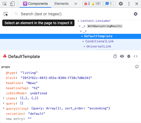
Copy omelette/src/components/manage/Blocks/Listing/DefaultTemplate.jsx to src/customizations/components/manage/Blocks/Listing/DefaultTemplate.jsx and add the date inside the iteration over list items.
The React developer tools provide a selector to find the component we need to override.
 1import React from 'react';
 2import PropTypes from 'prop-types';
 3import { ConditionalLink, FormattedDate } from '@plone/volto/components';
 4import { flattenToAppURL } from '@plone/volto/helpers';
 5
 6import { isInternalURL } from '@plone/volto/helpers/Url/Url';
 7
 8const DefaultTemplate = ({ items, linkTitle, linkHref, isEditMode }) => {
 9  let link = null;
10  let href = linkHref?.[0]?.['@id'] || '';
11
12  if (isInternalURL(href)) {
13    link = (
14      <ConditionalLink to={flattenToAppURL(href)} condition={!isEditMode}>
15        {linkTitle || href}
16      </ConditionalLink>
17    );
18  } else if (href) {
19    link = <a href={href}>{linkTitle || href}</a>;
20  }
21
22  return (
23    <>
24      <div className="items">
25        {items.map((item) => (
26          <div className="listing-item" key={item['@id']}>
27            <ConditionalLink item={item} condition={!isEditMode}>
28              <div className="listing-body">
29                <h4>{item.title ? item.title : item.id}</h4>
30                {item.review_state === 'published' && item.effective && (
31                  <p className="discreet">
32                    <FormattedDate date={item.effective} includeTime />
33                  </p>
34                )}
35                <p>{item.description}</p>
36              </div>
37            </ConditionalLink>
38          </div>
39        ))}
40      </div>
41
42      {link && <div className="footer">{link}</div>}
43    </>
44  );
45};
46DefaultTemplate.propTypes = {
47  items: PropTypes.arrayOf(PropTypes.any).isRequired,
48  linkMore: PropTypes.any,
49  isEditMode: PropTypes.bool,
50};
51export default DefaultTemplate;
The result should look like this:

12.6. Summary#
Component shadowing allows you to modify and extend views and other components in Volto.
It is a powerful feature for making changes without the need for complex configuration or maintaining a fork of the code.
You need to restart Volto when you add a new override.
See also
Volto Hands-On training: Header component