9. Brief introduction to Volto blocks#
We will use Volto blocks to compose the homepage.
Volto features the Pastanaga Editor Engine, allowing you to compose a page visually using blocks. The editor allows you to add, modify, reorder and delete blocks. Blocks provide the user the ability to display content in an arbitrary way, although blocks can also define behavior and can have specific features. Blocks are composed of two basic (and required) components: the Block edit and view components.
By default, Volto ships with a basic set of Blocks, including Title, Text, Image, Video, Listing, Search, Table, ToC and Maps.
Note
Volto Blocks are not enabled by default in Plone content types.
However, the plone.volto package enables Blocks for the Document content type,
so you will be able to use Blocks when you create or edit a page.
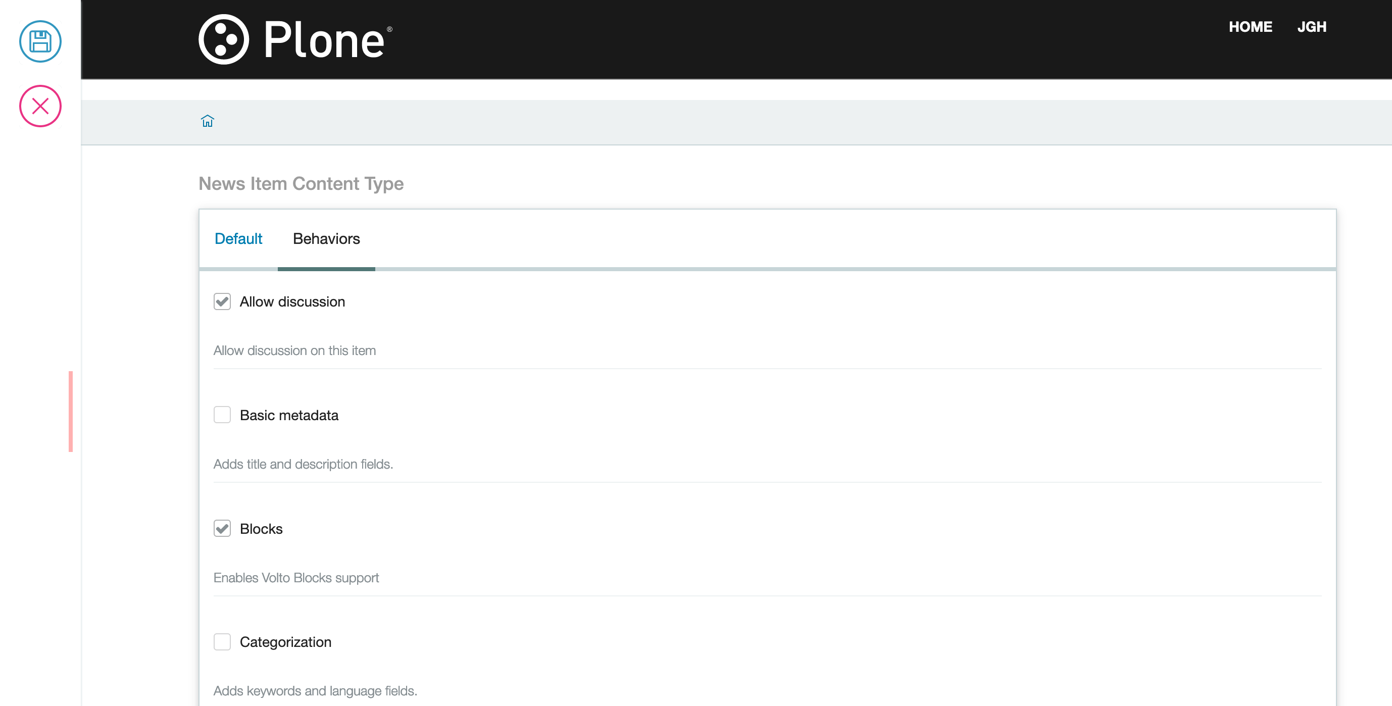
9.1. How to manually enable Blocks on a content type#
There is a behavior called Blocks made available by plone.restapi.
To enable it you need to access the Plone backend running at http://localhost:3000/controlpanel/dexterity-types.
Thre you can choose a content type and enable Blocks in the Behaviors tab.
Test the Blocks behavior for the content type you've just added it to, by creating a new object of that type from the Volto frontend using the toolbar.
9.2. Blocks anatomy#
Every Block is composed of an edit (Edit.jsx) component and a view (View.jsx) component.
Create your first block in the project by adding these two components in a new directory in src/components/Blocks/highlight.
This is the Edit.jsx:
import React from "react";

const Edit = (props) => {
  return <div>I'm the Highlight edit component!</div>;
};

export default Edit;
and the View.jsx.
import React from "react";

const View = (props) => {
  return <div>I'm the Highlight view component!</div>;
};

export default View;
9.2.1. Block view component props#
The view component of a block receives these props (properties) from the Blocks Engine:
id - the unique ID for the current block
properties - the current content
data - the data of the block (stored in the block itself)
You can use them to render the view component.
9.2.2. Block edit component props#
The edit component of a block receives these props from the Blocks Engine:
type - the type of the block
id - the unique ID for the current block
data - the data of the block (stored in the block itself)
selected - (Bool) true if the block is currently selected
index - the block index order in the list of blocks
pathname - the current URL pathname
onAddBlock - handler for adding a block in the block list
onMutateBlock - handler for mutating a block type into another
onChangeBlock - handler for changing the data of that block
onSelectBlock - handler for selecting the block
onDeleteBlock - handler for deleting the block
onFocusPreviousBlock - handler for focusing the previous block in the block list
onFocusNextBlock - handler for focusing the next block in the block list
handleKeyDown - handler for managing press keys while the block is selected
onMoveBlock - handler for moving blocks
You can use all these props to render your edit block and model its behavior.
9.3. Register Block Files in index#
To help keeping paths for importing components clean we use index files in several places in Volto projects. You can find a index.js under src/components/. In there we directly export the Block components directly from there respective files. This is to make it easier to import components in other places in the project, without having to remember all their paths.
components/index.js
import HighlightBlockEdit from "./Blocks/highlight/Edit";
import HighlightBlockView from "./Blocks/highlight/View";

export { HighlightBlockEdit, HighlightBlockView };
9.4. Blocks settings#
We need to configure the project to make it aware of a new block by adding it to the object configuration for that we need the 2 blocks components we created and a svg icon that will be displayed in the blocks chooser. This will gain be done in the projects config file
Import those before the import '@plone/volto/config'; line:
import { HighlightBlockView, HighlightBlockEdit } from "@package/components";
import heroSVG from "@plone/volto/icons/hero.svg";
Register it inside the applyConfig() function:
config.blocks.blocksConfig.highlight = {
  id: "highlight",
  title: "Highlight",
  icon: heroSVG,
  group: "common",
  view: HighlightBlockView,
  edit: HighlightBlockEdit,
  restricted: false,
  mostUsed: true,
  sidebarTab: 1,
};
Our new block should be ready to use in the editor.