7. Make the block extensible#
Wouldn't it be nice if we could have a way to customize, per column, how the
values are rendered, and go even further than the textTemplate field would
allow?
Let's create the following extension mechanism. For any column, we'll be able to choose between available "cell renderers".
These would be components that get the value passed and can render themselves as they want. For example, we could implement a "progress bar" that could be used to render the numbers in a column as a solid bar of color. We'll also migrate the text template field to the new system.
What's more, we'll use the global Volto config registry to register our custom components, so it will be completely open to extension from projects or other add-ons.
We could use the global config.settings from the src/index.js object to
register the new cell renderers.
But this functionality is directly related to our custom data block, so let's just use the block's config object.
import { TextTemplateRenderer, ProgressCellRenderer } from './CellRenderer';

// ...
  config.blocks.blocksConfig.dataTable = {
    id: 'dataTable',
    title: 'Data Table',
    icon: tableSVG,
    group: 'common',
    view: DataTableView,
    edit: DataTableEdit,
    restricted: false,
    mostUsed: false,
    sidebarTab: 1,
    security: {
      addPermission: [],
      view: [],
    },
    cellRenderers: {
      textTemplate: {
        id: 'textTemplate',
        title: 'Text Template',
        view: TextTemplateRenderer,
        schemaExtender: TextTemplateRenderer.schemaExtender,
      },
      progress: {
        id: 'progress',
        title: 'Progress',
        view: ProgressCellRenderer,
      },
    },
  };
// ...
Notice the schemaExtender field. We'll use it to allow each extension to
provide its fields in the column edit widget.
volto-object-widget allows the schema used in its FlatObjectList widget to
be extended by a provided schema extender.
We'll integrate with that.
The old text template-based implementation can be moved to a component and
a schema extension. To be more precise, now it's the time to remove the
textTemplate field from the ColumnSchema.properties and the default
fieldset.
This will go inside a new folder called CellRenderer and a new JSX file,
addons/datatable-tutorial/src/CellRenderer/TextTemplate.jsx:
import { cloneDeep } from 'lodash';

const TextTemplateRenderer = ({ column, value }) => {
  return column.textTemplate ? column.textTemplate.replace('{}', value) : value;
};

TextTemplateRenderer.schemaExtender = (schema, data) => {
  if (!data.renderer === 'textTemplate') return schema;

  schema = cloneDeep(schema);

  schema.properties.textTemplate = {
    title: 'Text template',
    description: 'Add suffix/prefix to text. Use {} for value placeholder',
  };

  schema.fieldsets[0].fields.push('textTemplate');

  return schema;
};

export default TextTemplateRenderer;
In the CellRenderer folder, add the Progress.jsx cell renderer.
For this one, we don't need to extend the schema.
import React from 'react';

import { Progress as UiProgress } from 'semantic-ui-react';

const Progress = ({ value }) => {
  const v = Math.round(parseFloat(value));
  return <UiProgress percent={v} />;
};

export default Progress;
Add the src/CellRenderer/index.js file:
export ProgressCellRenderer from './Progress';
export TextTemplateRenderer from './TextTemplate';
Note
As an exercise, you could extend the Progress renderer to include a color field. Consider building a color widget using react-color.
7.1. Making use of our new renderers#
7.1.1. Renderer within the edit component#
The ColumnSchema needs to be tweaked to add the new renderer field.
This is found within the add-on src/DataTable/schema.js and it can be as simple as:
renderer: {
  title: 'Format',
  choices: [],
},
Now, back to the src/DataTable/DataTableEdit.js component, we'll add this
schema tweaking code:
// ...
import config from '@plone/volto/registry';

const tweakSchema = (schema, data, file_data) => {
  const columnsField = schema.properties.columns;
  const ColumnsSchema = columnsField.schema;

  const columns = (file_data?.meta?.fields || []).sort().map((n) => [n, n]);
  ColumnsSchema.properties.column.choices = columns;

  const { cellRenderers } = config.blocks.blocksConfig.dataTable;
  const renderers = Object.keys(cellRenderers).map((k) => [
    k,
    cellRenderers[k].title,
  ]);
  ColumnsSchema.properties.renderer.choices = renderers;

  columnsField.schemaExtender = (schema, data) => {
    const extension = data.renderer
      ? cellRenderers[data.renderer].schemaExtender
      : null;
    return extension ? extension(schema, data) : schema;
  };

  return schema;
};
// ...
With the "schema tweaking code" we're doing three things:
Add the columns from the file as choices to the "Column" widget.
Provide the "renderer" field with the available
cellRendererchoices.Plug into the
schemaExtenderof thecolumnsFieldour own schema extender.
And we'll replace the old schema tweak with the new one, still in the src/DataTable/DataTableEdit.js component:
const schema = tweakSchema(TableSchema(props), data, file_data);
Notice the columnsField.schemaExtender bit, as that is a mechanism of the
ObjectWidgetList to allow per-object schema customization.
It is a function with signature (schema, data, intl) => schema.
7.1.2. Renderer within the view component#
Now that we have our renderers registered for our columns, it's time to use
them in our component view.
Back to the src/DataTable/DataTableView.js component, we'll need to first
import the Volto global registry as config:
import config from '@plone/volto/registry';
Then after our formatter, we add the following renderer code:
const Cell = ({ column, value }) => {
  const { renderer } = column;

  const Render = renderer
    ? config.blocks.blocksConfig.dataTable.cellRenderers[renderer].view
    : null;
  return Render ? <Render column={column} value={value} /> : value;
};
And we finish the view changes by using our Cell renderer to render the table cell data:
<Table.Cell textAlign={col.textAlign} key={`${y}-${i}`}>
  <Cell value={o[col.column] ?? ''} column={col} />
</Table.Cell>
Our final src/DataTable/DataTableView.js file will look like this:
import React from 'react';
import { Table } from 'semantic-ui-react';
import { withFileData } from '@plone-collective/volto-datatable-tutorial/hocs';
import config from '@plone/volto/registry';

const format = (data) => {
  return {
    fixed: data.fixed,
    compact: data.compact,
    basic: data.basic ? 'very' : undefined,
    celled: data.celled,
    inverted: data.inverted,
    striped: data.striped,
  };
};

const Cell = ({ column, value }) => {
  const { renderer } = column;

  const Render = renderer
    ? config.blocks.blocksConfig.dataTable.cellRenderers[renderer].view
    : null;
  return Render ? <Render column={column} value={value} /> : value;
};

const DataTableView = ({ file_data, data }) => {
  const columns =
    data.columns?.length > 0
      ? data.columns
      : file_data?.meta?.fields?.map((n) => ({
          column: n,
        }));

  return file_data ? (
    <Table {...format(data)}>
      <Table.Header>
        <Table.Row>
          {columns.map((col, i) => (
            <Table.HeaderCell key={i} textAlign={col.textAlign}>
              {col.title || col.column}
            </Table.HeaderCell>
          ))}
        </Table.Row>
      </Table.Header>
      <Table.Body>
        {file_data.data.map((o, i) => (
          <Table.Row key={i}>
            {columns.map((col, y) => (
              <Table.Cell textAlign={col.textAlign} key={`${y}-${i}`}>
                <Cell value={o[col.column] ?? ''} column={col} />
              </Table.Cell>
            ))}
          </Table.Row>
        ))}
      </Table.Body>
    </Table>
  ) : (
    <div>No data</div>
  );
};

export default withFileData(({ data: { file_path } }) => file_path)(
  DataTableView,
);
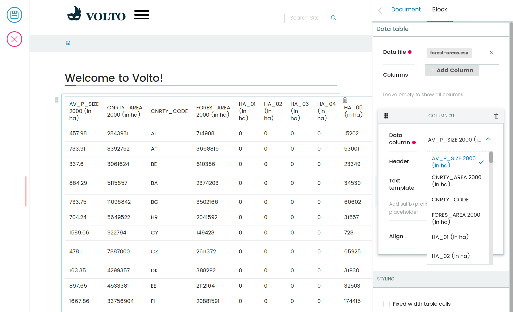
Now if you select a column that has floating values up to 100, and select the
Progress template, that column will display the values as a progress bar:
This concludes our hands-on tutorial! You can find a copy of the final code here: collective/volto-datatable-tutorial