6. Customizable columns#
Let's add a bit more control over how the columns are rendered. This is
a "low-hanging fruit", thanks to Volto's built-in ObjectWidget and
ObjectWidgetList.
Note: these components were ported from the volto-object-widget add-on,
where they were initially developed. By themselves, they are more or less a remix
of Volto's built-in Form, but adjusted to provide an equivalent of the classic
DataGridField.
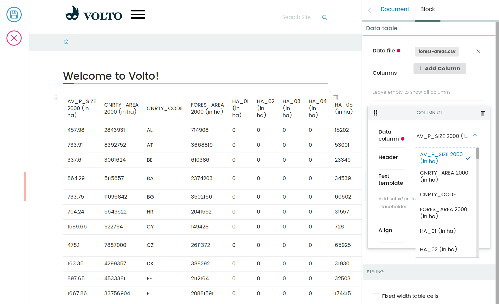
6.1. What would we like to change about the columns?#
Let's go for title, text align, and another field that would allow us to tweak how the values are rendered.
We'll continue without i18n integration, for now, to keep things simple.
Inside the src/DataTable/schema.js module, add a new schema for the columns:
 1const ColumnSchema = () => ({
 2  title: 'Column',
 3  fieldsets: [
 4    {
 5      id: 'default',
 6      title: 'Default',
 7      fields: ['column', 'title', 'textTemplate', 'textAlign'],
 8    },
 9  ],
10  properties: {
11    title: {
12      title: 'Header',
13    },
14    textTemplate: {
15      title: 'Text template',
16      description: 'Add suffix/prefix to text. Use {} for value placeholder',
17    },
18    textAlign: {
19      title: 'Align',
20      // widget: 'text_align',
21      choices: [
22        ['left', 'left'],
23        ['center', 'center'],
24        ['right', 'right'],
25      ],
26    },
27    column: {
28      title: 'Data column',
29      choices: [],
30    },
31  },
32  required: ['column'],
33});
Now, let's make use of this schema. We'll add a new field to the
TableSchema to src/DataTable/schema.js:
//...
properties: {
    //...
    columns: {
      title: 'Columns',
      description: 'Leave empty to show all columns',
      schema: ColumnSchema({ intl }),
      widget: 'object_list',
    },
}
Don't forget to add the columns field name to the default fieldset.
Within src/DataTable/schema.js, TableSchema default fieldset add:
export const TableSchema = ({ intl }) => ({
  title: 'Data table',

  fieldsets: [
    {
      id: 'default',
      title: intl.formatMessage(messages.defaultFieldset),
      fields: ['file_path', 'columns'], // columns added to fields
    },
    // ...
  ]
})
Now we need to plug the available columns as choices to the schema.
In Plone's world, we would write an adapter that binds the widget to the context, or something like that.
Let's keep things simple though, and hard-code the available choices to the schema.
We could do this in the schema function, but it's better to keep the schema readable and without logic.
We'll mutate the schema in the component before we pass it to the <InlineForm> component.
Within src/DataTable/DataTableEdit.js, replace the DataTableEdit code block with:
const DataTableEdit = (props) => {
  const { selected, onChangeBlock, block, data, file_data } = props;
  const schema = TableSchema(props);
  const choices = (file_data?.meta?.fields || []).sort().map((n) => [n, n]);
  schema.properties.columns.schema.properties.column.choices = choices;

  return (
    // <> represents a React Fragment see https://legacy.reactjs.org/docs/fragments.html#short-syntax for more details
    <>
      <SidebarPortal selected={selected}>
        <InlineForm
          schema={schema}
          title={schema.title}
          onChangeField={(id, value) => {
            onChangeBlock(block, {
              ...data,
              [id]: value,
            });
          }}
          formData={data}
        />
      </SidebarPortal>
      <DataTableView {...props} />
    </>
  );
};
We'll need to also inject the file data into the edit form.
We didn't need to before, but now it needs to know the available columns.
Now that we're wrapping the edit component in two HOCs, we'll use Redux's
compose to play nice. If you're not familiar with functional programming
concepts, compose is simply a method to express chained function calls in
a more readable way. So instead of func_c(func_b(func_a(input))) we'll do:
compose(func_a, func_b, func_c)(input)
This means that we need to first import the compose method from Redux within our
src/DataTable/DataTableEdit.js file:
import { compose } from 'redux';
import {
  withBlockDataSource,
  withFileData,
} from '@plone-collective/datatable-tutorial/hocs';
Then within src/DataTable/DataTableEdit.js add bellow the DataTableEdit code block:
const getFilePath = ({ data: { file_path } }) => file_path?.[0];

export default compose(
  withFileData(getFilePath),
  withBlockDataSource({
    getFilePath,
    icon: tableSVG,
    title: 'Data table',
  }),
)(DataTableEdit);
Adjust withFileData.js to match the fact that we pass it directly the file path and not an array:
const id = file_path?.['@id'];
6.2. Use the columns in the view#
Let's go back to the View component and use the column definitions from the block data.
Within src/DataTable/DataTableView.js, replace the existing DataTableView code block with:
const DataTableView = ({ file_data, data }) => {
  const columns =
    data.columns?.length > 0
      ? data.columns
      : file_data?.meta?.fields?.map((n) => ({
          column: n,
        }));

  return file_data ? (
    <Table {...format(data)}>
      <Table.Header>
        <Table.Row>
          {columns.map((col, i) => (
            <Table.HeaderCell key={i} textAlign={col.textAlign}>
              {col.title || col.column}
            </Table.HeaderCell>
          ))}
        </Table.Row>
      </Table.Header>
      <Table.Body>
        {file_data.data.map((o, i) => (
          <Table.Row key={i}>
            {columns.map((col, y) => (
              <Table.Cell textAlign={col.textAlign}>
                {col.textTemplate
                  ? col.textTemplate.replace('{}', o[col.column])
                  : o[col.column]}
              </Table.Cell>
            ))}
          </Table.Row>
        ))}
      </Table.Body>
    </Table>
  ) : (
    <div>No data</div>
  );
};
These minimal changes enable our code to have custom column titles, custom text align, and to affect the way the values are rendered in the cells.
Of course, now the sky is the limit. We could enhance this with number formatting provided by a library to humanize and automatically format those values, or d3's format. There's plenty of choices.
6.3. Write a new Volto widget#
Let's enhance the edit form by creating an align widget for the text align field.
Let's create src/widgets/TextAlign.jsx.
import React from 'react';
import { Button } from 'semantic-ui-react';
import { FormFieldWrapper, Icon } from '@plone/volto/components';

import alignLeftSVG from '@plone/volto/icons/align-left.svg';
import alignRightSVG from '@plone/volto/icons/align-right.svg';
import alignJustifySVG from '@plone/volto/icons/align-justify.svg';
import alignCenterSVG from '@plone/volto/icons/align-center.svg';

const VALUE_MAP = [
  ['left', alignLeftSVG],
  ['right', alignRightSVG],
  ['center', alignCenterSVG],
  ['justify', alignJustifySVG],
];

export default (props) => {
  const { value, onChange, id } = props;
  return (
    <FormFieldWrapper {...props}>
      <div className="align-tools">
        {VALUE_MAP.map(([name, icon]) => (
          <Button.Group>
            <Button
              icon
              basic
              compact
              active={value === name}
              aria-label={name}
              onClick={() => {
                onChange(id, name);
              }}
            >
              <Icon name={icon} size="24px" />
            </Button>
          </Button.Group>
        ))}
      </div>
    </FormFieldWrapper>
  );
};
We also need to create src/widget/index.js file to export our widget:
export TextAlign from './TextAlign';
Now we'll register it in the add-on src/index.js default configuration method:
import { TextAlign } from './widgets';

// ... change in the default configuration function
if (!config.widgets.widget.text_align)
    config.widgets.widget.text_align = TextAlign;
A widget is a component with three main props: id, value, and onChange.
The widget needs to call back the onChange callback with an id and new value.
Note
It's much better if you model your UI interactions in terms of forms and
widgets. Widgets are reusable and their limited API forces you to focus on
a reusable implementation. They should not depend on block data or block
properties, for example. Just input value and the onChange callback.
To conform to the UI requirements, Volto provides the FormFieldWrapper
component which works on a very nice and easy principle:
drop whatever control inside it as a child
it will render that control neatly wrapped with the label, description, error messages, and so on.
This concept is somewhat similar to Zope's ZPT macro and slot system.
Now go back to the schema, and let's use the new text align widget.
Within src/DataTable/schema.js, uncomment the widget used in TableSchema textAlign property, and remove the choices property.
// change in TableSchema properties
textAlign: {
  title: 'Align',
  widget: 'text_align', // we can now use the text_align widget
},
Note
The object_list widget provides drag/drop sorting of the columns, so it's
possible to reorder the columns.
We could say it's done for now, but let's go further and explore how to enhance this add-on's reusability and extensibility.