
27. The Sponsors component#
In a previous chapter, Content types III: Sponsor, you created the sponsor content type. Now let's learn how to display content of this type.
In this part you will:
Add a component advertising sponsors at the bottom of all pages
Display data from fetched content
Topics covered:
Display a React component in a slot
Use a Volto Redux action to fetch data from Plone backend via the REST API
Style the component with Semantic UI
Check out mastering-plone-project at tag searchable:
git checkout searchable
The code at the end of the chapter:
git checkout sponsors
More info in The code for the training
For sponsors we will stay with the default view as we will only display the sponsors in the footer and not modify their own pages. Using what you learned in Add a custom view you should be able to write a view for sponsors if you want to.

27.1. Slots#
React components let you split the UI into independent, reusable pieces, and think about each piece in isolation. Volto comes with several components like header, footer, and sidebar. In fact everything in the UI is built of nested components.
We've already seen how to register a custom component as the view for a content type.
In this case we'll do something different, and add a component to a slot.
A slot is a defined plugin point in the existing Volto components where add-ons can show their own components.
Adding a sponsors component to the belowContent slot will let it be displayed below every content view.
See also
27.2. The Sponsors component#
To create the component Sponsors we add a folder frontend/packages/volto-ploneconf-site/src/components/Sponsors/ with a file Sponsors.jsx.
In this file we can now define our new component.
Start with a placeholder to see that your registration actually works:
1const Sponsors = () => {
2  return <h3>Our sponsors</h3>;
3};
4
5export default Sponsors;
A component is just a function that returns JSX markup.
Now we can configure this component to be shown in the belowContent slot.
Edit the file frontend/packages/volto-ploneconf-site/config/settings.ts.
 1import type { ConfigType } from '@plone/registry';
 2import type { BlockExtension, ViewsConfig } from '@plone/types';
 3import TalkView from '../components/Views/TalkView';
 4import TalkListingBlockVariation from '../components/variations/TalkListingBlockVariation';
 5import Sponsors from '../components/Sponsors/Sponsors';
 6
 7export default function install(config: ConfigType) {
 8  // Language settings
 9  config.settings.defaultLanguage = 'en';
10  // Additional language settings for Volto 19 and above, add as many supported languages as needed
11  // Languages not added to supportedLanguages will not be included in the build
12  // config.settings.supportedLanguages = ['en'];
13
14  config.views = {
15    ...(config.views as ViewsConfig),
16    contentTypesViews: {
17      ...config.views.contentTypesViews,
18      talk: TalkView,
19    },
20  };
21
22  config.blocks.blocksConfig.listing.variations = [
23    ...(config.blocks.blocksConfig.listing.variations as BlockExtension[]),
24    {
25      id: 'talks',
26      title: 'Talks',
27      template: TalkListingBlockVariation,
28    },
29  ];
30
31  config.registerSlotComponent({
32    slot: 'belowContent',
33    name: 'sponsors',
34    component: Sponsors,
35  });
36
37  return config;
38}
After restarting the frontend with make frontend-start, we are now ready to visit an arbitrary page to see the new component.
Tip
A restart is necessary for Volto to find newly added files. As long as you just edit existing files of your app, your browser will update automatically.
27.3. Fetch the sponsors data#
With our Sponsors component in place we can take the next step and explore Volto some more to figure out how it does data fetching.
As the data is in the backend, we need to find a way to fetch it. Volto provides various predefined actions to communicate with the backend (fetching content, creating content, editing content, etc.). A Redux action communicates with the backend and has a common pattern. It makes a request to the backend via the REST API and updates the global app store (in browser memory) according to the response of the backend. A component can call actions, and select data from the store.
For more information which actions are already provided by Volto have a look at frontend/core/packages/volto/src/actions.
Our component will use the action searchContent to fetch the data of all sponsors.
It takes as arguments the path where to search, the search parameters, and an argument with which key the data should be stored in the store.
Remember: the result is stored in the global app store.
So if we call the action searchContent to fetch data of sponsors (that is, all content items with type sponsor), then we can access this data from the store.
The React hook useEffect lets you perform side effects after a component is rendered.
We use it to fetch the sponsors data from the backend when the component is first loaded.
 1import { useEffect } from 'react';
 2import { useDispatch } from 'react-redux';
 3import { searchContent } from '@plone/volto/actions/search/search';
 4
 5const Sponsors = () => {
 6  const dispatch = useDispatch();
 7
 8  useEffect(() => {
 9    dispatch(
10      searchContent(
11        '/',
12        {
13          portal_type: ['sponsor'],
14          review_state: 'published',
15          sort_on: 'effective',
16          metadata_fields: ['level', 'url'],
17        },
18        'sponsors',
19      ),
20    );
21  }, [dispatch]);
22
23  return <h3>Our sponsors</h3>;
24};
25
26export default Sponsors;
Search options#
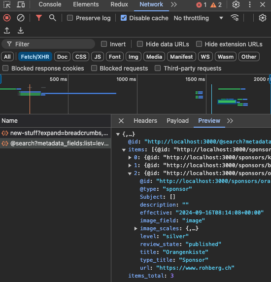
The default representation for search results is a summary that contains only the most basic information like title, review state, type, path and description.
metadata_fieldslets us specify additional catalog metadata columns that we'd like to include in the results.We could also pass the option
fullobjects: trueto get the full serialization of all fields from the content item. However this requires loading each object fully instead of just using data in the catalog, so it is slower.sort_onspecifies which catalog index should be used to sort the results.
Tip
Check which results you get in the Network tab of the browser developer tools:
See also
REST API Documentation Search
27.4. Use the fetched data#
Let's connect our component to the data which has been fetched into the store.
The hook useSelector allows a component to select a specific part of the data in the store.
Tip
It's worth exploring the store of our app with the Redux Dev Tools.
There you can see what is stored in state.search.subrequests.sponsors.
And you can walk through time and watch how the store is changing.
1const sponsors = useSelector((state) =>
2  groupedSponsorsByLevel(state.search.subrequests.sponsors?.items),
3);
Now the component has access to the sponsors data, and will re-render when it is updated after the searchContent action has finished.
Note
This note is advanced and can be skipped on a first reading.
So far we fetch the sponsors data once, after the component is first mounted.
The mounting is done once on the first visit of a page of our app.
What if a new sponsor is added or a sponsor is published?
We want to achieve a re-rendering of the component when the user publishes a new sponsor.
To subscribe to these changes in workflow status, we extend the dependencies of the useEffect hook.
 1const workflowTransition = useSelector((state) => state.workflow.transition);
 2
 3useEffect(() => {
 4  dispatch(
 5    searchContent(
 6      '/',
 7      {
 8        portal_type: ['sponsor'],
 9        review_state: 'published',
10        sort_on: 'effective',
11        metadata_fields: ['level', 'url'],
12      },
13      'sponsors',
14    ),
15  );
16}, [dispatch, workflowTransition]);
Listening to this subscription the component fetches the data from the store if a workflow state changes.
27.5. Render the sponsor data#
With the data fetched and accessible in the variable sponsors, we can
now render the sponsors data.
We prepare the sponsors data as a dictionary grouped by sponsor level:
const groupedSponsorsByLevel = (array = []) =>
  array.reduce((obj, item) => {
    let token = item.level?.token || 'bronze';
    obj[token] ? obj[token].push(item) : (obj[token] = [item]);
    return obj;
  }, {});
Which results in an dictionary Object available with our subscription sponsors:
{
  bronze: [sponsordata1, sponsodata2]
}
Now we can show a nested list.
 1{Object.keys(sponsors).map((level) => {
 2  return (
 3    <div key={level} className={'sponsorlevel ' + level}>
 4      <h3>{level.toUpperCase()}</h3>
 5      <div className="ui centered grid">
 6        <div className="centered row">
 7          {sponsors[level].map((item) => (
 8            <div key={item['@id']} className="sponsor column">
 9              <Component
10                componentName="PreviewImage"
11                item={item}
12                image_field="logo"
13                imageField="logo"
14                alt={item.title}
15                width="100"
16                height="auto"
17                className="ui image"
18              />
19            </div>
20          ))}
21        </div>
22      </div>
23    </div>
24  );
25})}
We group the sponsors by sponsorship level.
An object sponsors using the sponsorship level as key helps to build rows with sponsors by sponsorship level.
The Volto component PreviewImage is used to display the logo.
We also benefit from the Semantic UI grid component to build our list of sponsors. The styling can be customized but these predefined components help simplify the code and achieve an app-wide harmonic style.
See the new footer. A restart is not necessary, as we didn't add a new file.
27.6. Exercise#
Modify the component to display a sponsor logo as a link to the sponsors website.
The address is stored in sponsor field url.
27.7. Summary#
You know how to fetch data from backend. With the data you are able to create a component displayed at any place in the website.