14. Customizing Volto components#
In this part you will:
Customize existing components and views
Tools and techniques covered:
Component shadowing
View for a content type
Checkout volto-ploneconf at tag "initial":
git checkout initial
The code at the end of the chapter:
git checkout overrides
More info in The code for the training
14.1. Component shadowing#
We use a technique called component shadowing to override an existing Volto component with our local custom version, without having to modify Volto's source code at all.
You have to place the replacing file in the same folder path inside the packages/volto-ploneconf/src/customizations/ folder of your app as the original file in core/packages/volto/src/.
Every time you add a file to your app, you have to restart Volto for changes taking effect. From that point on, the hot module reloading should kick in and reload the page automatically on changes.
You can customize any module in Volto, including actions and reducers, not only components.
The Volto code can be found in core/packages/volto/.
14.2. The footer#
The React developer tools provide a selector to find the component we need to override.
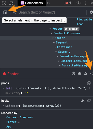
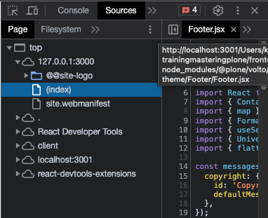
Customize the footer by copying core/packages/volto/src/components/theme/Footer/Footer.jsx to your customization folder at packages/volto-ploneconf/src/customizations/components/theme/Footer/Footer.jsx.
After a restart you can change this Footer component and the changes are shown immediately due to hot module reloading.
14.3. The news item view#
We want to show the date a News Item is published. This way visitors can see at a glance if they are looking at current news. This information isn't shown by default. So you need to customize the way a News Item is rendered.
A News Item has date attributes. The attributes of a content type instance are defined by the schema of a content type and possible behaviors. We had a look at schemas in Content types I and Content types II: Talk. Behaviors are being described in Behaviors. These date attributes are available when the content is fetched by the frontend. But let's first have a look how these attributes are used in a Volto component.
The Volto view component to render a News Item is in core/packages/volto/src/components/theme/View/NewsItemView.jsx.
 1/**
 2 * NewsItemView view component.
 3 * @module components/theme/View/NewsItemView
 4 */
 5
 6import React from 'react';
 7import PropTypes from 'prop-types';
 8import { Container as SemanticContainer } from 'semantic-ui-react';
 9import { hasBlocksData, flattenHTMLToAppURL } from '@plone/volto/helpers';
10import RenderBlocks from '@plone/volto/components/theme/View/RenderBlocks';
11import config from '@plone/volto/registry';
12
13/**
14 * NewsItemView view component class.
15 * @function NewsItemView
16 * @params {object} content Content object.
17 * @returns {string} Markup of the component.
18 */
19const NewsItemView = ({ content }) => {
20  const Image = config.getComponent({ name: 'Image' }).component;
21  const Container =
22    config.getComponent({ name: 'Container' }).component || SemanticContainer;
23
24  return hasBlocksData(content) ? (
25    <Container id="page-document" className="view-wrapper newsitem-view">
26      <RenderBlocks content={content} />
27    </Container>
28  ) : (
29    <Container className="view-wrapper">
30      {content.title && (
31        <h1 className="documentFirstHeading">
32          {content.title}
33          {content.subtitle && ` - ${content.subtitle}`}
34        </h1>
35      )}
36      {content.description && (
37        <p className="documentDescription">{content.description}</p>
38      )}
39      {content.image && (
40        <Image
41          className="documentImage ui right floated image"
42          alt={content.title}
43          title={content.title}
44          item={content}
45          imageField="image"
46          responsive={true}
47        />
48      )}
49      {content.text && (
50        <div
51          dangerouslySetInnerHTML={{
52            __html: flattenHTMLToAppURL(content.text.data),
53          }}
54        />
55      )}
56    </Container>
57  );
58};
59
60/**
61 * Property types.
62 * @property {Object} propTypes Property types.
63 * @static
64 */
65NewsItemView.propTypes = {
66  content: PropTypes.shape({
67    title: PropTypes.string,
68    description: PropTypes.string,
69    text: PropTypes.shape({
70      data: PropTypes.string,
71    }),
72  }).isRequired,
73};
74
75export default NewsItemView;
Note
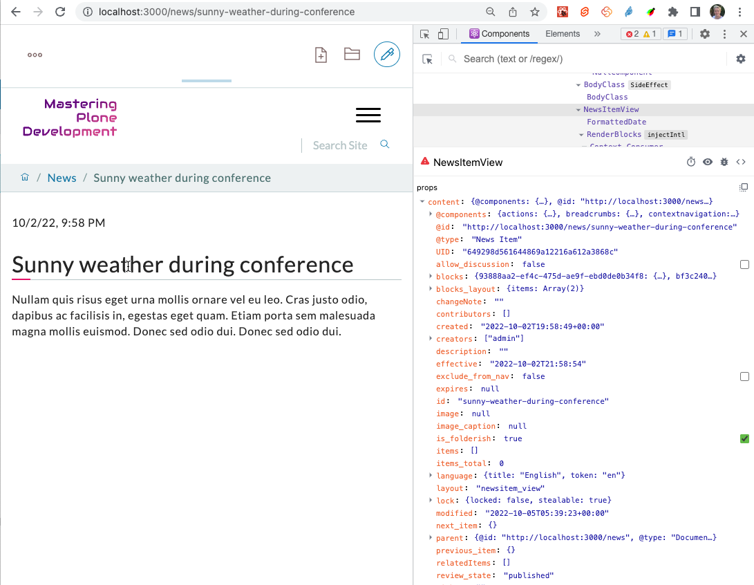
contentis passed toNewsItemViewand represents the content item as it is serialized by the REST API. Thecontentdata has been fetched by an action on navigating to routehttp://localhost:3000/my-news-item.The view displays various attributes of the News Item using
content.title,content.descriptionorcontent.text.data.You can inspect all data hold by
contentusing the React Developer Tools for Firefox or Chrome:
Copy this file from core/packages/volto/src/components/theme/View/NewsItemView.jsx to packages/volto-ploneconf/src/customizations/components/theme/View/NewsItemView.jsx.
After restarting Volto, the new file is used when displaying a News Item.
To make sure your file is taken into effect, add a small change before the blocks <RenderBlocks content={content} />.
If it shows up you're good to go.
Tip
In you own projects you should always do a commit of the unchanged file and another commit after you changed the file. This way you will have a commit in your git history with the change you made. You will thank yourself later for that clean diff!
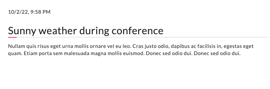
To display the date add the following before the text:
<p>{content.created}</p>
This will render something like 2022-10-02T21:58:54. This isn't user friendly. Let's use one of many helpers available in Volto.
Import the component FormattedDate from @plone/volto/components at the top of the file and use it to format the date in a human readable format.
 1/**
 2 * NewsItemView view component.
 3 * @module components/theme/View/NewsItemView
 4 */
 5
 6import React from 'react';
 7import PropTypes from 'prop-types';
 8import { Container as SemanticContainer } from 'semantic-ui-react';
 9import { hasBlocksData, flattenHTMLToAppURL } from '@plone/volto/helpers';
10import { FormattedDate } from '@plone/volto/components';
11import RenderBlocks from '@plone/volto/components/theme/View/RenderBlocks';
12import config from '@plone/volto/registry';
13
14/**
15 * NewsItemView view component class.
16 * @function NewsItemView
17 * @params {object} content Content object.
18 * @returns {string} Markup of the component.
19 */
20const NewsItemView = ({ content }) => {
21  const Image = config.getComponent({ name: 'Image' }).component;
22  const Container =
23    config.getComponent({ name: 'Container' }).component || SemanticContainer;
24
25  return hasBlocksData(content) ? (
26    <Container id="page-document" className="view-wrapper newsitem-view">
27      <p>
28        <FormattedDate date={content.created} includeTime />
29      </p>
30      <RenderBlocks content={content} />
31    </Container>
32  ) : (
33    <Container className="view-wrapper">
34      {content.title && (
35        <h1 className="documentFirstHeading">
36          {content.title}
37          {content.subtitle && ` - ${content.subtitle}`}
38        </h1>
39      )}
40      {content.description && (
41        <p className="documentDescription">{content.description}</p>
42      )}
43      {content.image && (
44        <Image
45          className="documentImage ui right floated image"
46          alt={content.title}
47          title={content.title}
48          item={content}
49          imageField="image"
50          responsive={true}
51        />
52      )}
53      {content.text && (
54        <div
55          dangerouslySetInnerHTML={{
56            __html: flattenHTMLToAppURL(content.text.data),
57          }}
58        />
59      )}
60    </Container>
61  );
62};
63
64/**
65 * Property types.
66 * @property {Object} propTypes Property types.
67 * @static
68 */
69NewsItemView.propTypes = {
70  content: PropTypes.shape({
71    title: PropTypes.string,
72    description: PropTypes.string,
73    text: PropTypes.shape({
74      data: PropTypes.string,
75    }),
76  }).isRequired,
77};
78
79export default NewsItemView;
The result should look like this:
Now another issue appears. There are various dates associated with any content object:
The date the item is created:
content.createdThe date the item is last modified
content.modifiedThe date the item is published
content.effective
In fact you most likely want to show the date when the item has been published. But while the item isn't yet published, this value isn't yet set and you will get an error. So we'll add some simple logic to show the effective date only if it exists.
{content.review_state === 'published' && content.effective && (
  <p>
    <FormattedDate date={content.effective} includeTime />
  </p>
)}
As we're in the HTML part of our React component, we surround the JavaScript code with curly braces. Inside JavaScript we embrace HTML in rounded braces.
14.4. Summary#
With component shadowing views and other components in Volto can be modified and extended.
Component shadowing a powerful mechanism making changes without the need of complex configuration or maintaining a fork of the code.
You need to restart Volto when you add a new overriding.
See also
Volto Hands-On training: Header component