29. Extending Volto With a FAQ Block Type – Mastering Plone 6 development

Extending Volto With a FAQ Block Type

29. Extending Volto With a FAQ Block Type#

Frontend chapter

Creating a new block type

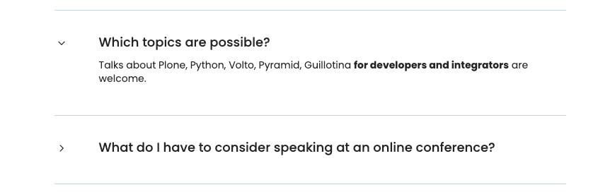
We want to provide some information for speakers of the conference: Which topics are possible? What do I have to consider speaking at an online conference? FAQ section would come in handy. This could be done by creating a block type that offers a form for question and answer pairs and displays an accordion.

Let's start with our fresh add-on we created in the last chapter Extending Volto with a custom add-on package.

Volto add-on volto-accordion-block
Editing Volto add-on volto-accordion-block

We need a view and an edit form for the block. Create a src/FAQ/BlockView.jsx and src/FAQ/BlockEdit.jsx.

The BlockView is a simple function component that displays a FAQ component with the data stored on the block.

 1import React from 'react';
 2import FAQ from './FAQ';
 3
 4const View = ({ data }) => {
 5  return (
 6    <div className="block faq">
 7      <FAQ data={data} />
 8    </div>
 9  );
10};
11
12export default View;

We outsource the FAQ component to file srch/FAQ/FAQ.jsx and make heavy use of Semantic UI components especially of an accordion with its respective behavior of expanding and collapsing.

1const FAQ = ({ data }) => {
2  const [activeIndex, setActiveIndex] = useState(new Set());
3
4  return data.faq_list?.faqs ? (
5    {data.faq_list.faqs.map((id_qa) => (

We primarily loop over the accordion elements and we remember the extended (not collapsed) elements.

Complete code of the FAQ component
 1import React, { useState } from 'react';
 2
 3import { Icon } from '@plone/volto/components';
 4import rightSVG from '@plone/volto/icons/right-key.svg';
 5import downSVG from '@plone/volto/icons/down-key.svg';
 6import AnimateHeight from 'react-animate-height';
 7
 8import { Accordion, Grid, Divider, Header } from 'semantic-ui-react';
 9
10const FAQ = ({ data }) => {
11  const [activeIndex, setActiveIndex] = useState(new Set());
12
13  return data.faq_list?.faqs ? (
14    <>
15      <Divider section />
16      {data.faq_list.faqs.map((id_qa) => (
17        <Accordion key={id_qa} fluid exclusive={false}>
18          <Accordion.Title
19            index={id_qa}
20            className="stretched row"
21            active={activeIndex.has(id_qa)}
22            onClick={() => {
23              const newSet = new Set(activeIndex);
24              activeIndex.has(id_qa) ? newSet.delete(id_qa) : newSet.add(id_qa);
25              setActiveIndex(newSet);
26            }}
27          >
28            <Grid>
29              <Grid.Row>
30                <Grid.Column width="1">
31                  {activeIndex.has(id_qa) ? (
32                    <Icon name={downSVG} size="20px" />
33                  ) : (
34                    <Icon name={rightSVG} size="20px" />
35                  )}
36                </Grid.Column>
37                <Grid.Column width="11">
38                  <Header as="h3">{data.faq_list.faqs_layout[id_qa][0]}</Header>
39                </Grid.Column>
40              </Grid.Row>
41            </Grid>
42          </Accordion.Title>
43          <div>
44            <Accordion.Content
45              className="stretched row"
46              active={activeIndex.has(id_qa)}
47            >
48              <Grid>
49                <Grid.Row>
50                  <Grid.Column width="1"></Grid.Column>
51                  <Grid.Column width="11">
52                    <div>
53                      <AnimateHeight
54                        key={id_qa}
55                        duration={300}
56                        height={activeIndex.has(id_qa) ? 'auto' : 0}
57                      >
58                        <div
59                          dangerouslySetInnerHTML={{
60                            __html: data.faq_list.faqs_layout[id_qa][1].data,
61                          }}
62                        />
63                      </AnimateHeight>
64                    </div>
65                  </Grid.Column>
66                </Grid.Row>
67              </Grid>
68            </Accordion.Content>
69          </div>
70          <Divider section />
71        </Accordion>
72      ))}
73    </>
74  ) : (
75    ''
76  );
77};
78
79export default FAQ;

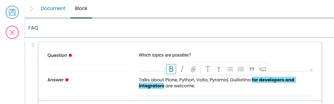
Let's see how the data is stored on the block. Open your BlockEdit. See the helper component SidebarPortal. Everything inside is displayed in the Sidebar.

 1import React from 'react';
 2import { SidebarPortal } from '@plone/volto/components';
 3
 4import FAQSidebar from './FAQSidebar';
 5import FAQ from './FAQ';
 6
 7const Edit = ({ data, onChangeBlock, block, selected }) => {
 8  return (
 9    <div className={'block faq'}>
10      <SidebarPortal selected={selected}>
11        <FAQSidebar data={data} block={block} onChangeBlock={onChangeBlock} />
12      </SidebarPortal>
13
14      <FAQ data={data} />
15    </div>
16  );
17};
18
19export default Edit;

We outsource the edit form in a file FAQSidebar.jsx which displays the form according a schema of question and answers. The onChangeBlock event handler is inherited, it stores the value on the block.

 1import React from 'react';
 2import { FAQSchema } from './schema';
 3import InlineForm from '@plone/volto/components/manage/Form/InlineForm';
 4
 5const FAQSidebar = ({ data, block, onChangeBlock }) => {
 6  return (
 7    <InlineForm
 8      schema={FAQSchema}
 9      title={FAQSchema.title}
10      onChangeField={(id, value) => {
11        onChangeBlock(block, {
12          ...data,
13          [id]: value,
14        });
15      }}
16      formData={data}
17    />
18  );
19};
20
21export default FAQSidebar;

We define the schema in schema.js.

 1export const FAQSchema = {
 2  title: 'FAQ',
 3  fieldsets: [
 4    {
 5      id: 'default',
 6      title: 'Default',
 7      fields: ['faq_list'],
 8    },
 9  ],
10  properties: {
11    faq_list: {
12      title: 'Question and Answers',
13      type: 'faqlist',
14    },
15  },
16  required: [],
17};

The field faq_list has a type 'faqlist'. This has to be registered as a widget in src/config.js. This configuration is the central place where your add-on can customize the hosting Volto app. It's the place where we later also register our new block type with information about its view and edit form.

1import FAQListEditWidget from './FAQ/FAQListEditWidget';
2
3export default function applyConfig(config) {
4  config.widgets.type.faqlist = FAQListEditWidget;
5
6  return config;
7}

Now we will code the important part of the whole block type: the widget FAQListEditWidget. We need a form that consists of a list of existing questions and answers. The text should be editable. Additional pairs of questions and answers should be addable. Next step will be to let the list be drag- and droppable to reorder the items. Also should an item be deletable. That's a lot. Let's start with the list of fields displaying the existing values.

Create a FAQListEditWidget.jsx.

 1import { Form as VoltoForm } from '@plone/volto/components';
 2
 3const FAQListEditWidget = (props) => {
 4  const { value = {}, id, onChange } = props;
 5  // id is the field name: faq_list
 6  // value is the form data (see example in schema.js)
 7
 8  // qaList: array of [id_question, [question, answer]]
 9  const qaList = (value.faqs || []).map((key) => [key, value.faqs_layout[key]]);
10
11  return (
12    // loop over question answer pairs *qaList*
13      <VoltoForm
14        onSubmit={({ question, answer }) => {
15          onSubmitQAPair(childId, question, answer);
16        }}
17        formData={{
18          question: value.faqs_layout[childId][0],
19          answer: value.faqs_layout[childId][1],
20        }}
21        schema={QuestionAnswerPairSchema(
22          props.intl.formatMessage(messages.question),
23          props.intl.formatMessage(messages.answer),
24        )}
25      />

You see the Volto Form component with its onSubmit event, the form data and the schema to be used.

Complete code of the FAQListEditWidget component
  1import React from 'react';
  2import { defineMessages, injectIntl } from 'react-intl';
  3import { v4 as uuid } from 'uuid';
  4import { omit, without } from 'lodash';
  5import move from 'lodash-move';
  6import { FormFieldWrapper, DragDropList, Icon } from '@plone/volto/components';
  7import { Form as VoltoForm } from '@plone/volto/components';
  8
  9import dragSVG from '@plone/volto/icons/drag.svg';
 10import trashSVG from '@plone/volto/icons/delete.svg';
 11import plusSVG from '@plone/volto/icons/circle-plus.svg';
 12
 13import { QuestionAnswerPairSchema } from './schema.js';
 14
 15const messages = defineMessages({
 16  question: {
 17    id: 'Question',
 18    defaultMessage: 'Question',
 19  },
 20  answer: {
 21    id: 'Answer',
 22    defaultMessage: 'Answer',
 23  },
 24  add: {
 25    id: 'add',
 26    defaultMessage: 'add',
 27  },
 28});
 29
 30export function moveQuestionAnswerPair(formData, source, destination) {
 31  return {
 32    ...formData,
 33    faqs: move(formData.faqs, source, destination),
 34  };
 35}
 36
 37const empty = () => {
 38  return [uuid(), ['', {}]];
 39};
 40
 41const FAQListEditWidget = (props) => {
 42  const { value = {}, id, onChange } = props;
 43  // id is the field name: faq_list
 44  // value is the form data (see example in schema.js)
 45
 46  const onSubmitQAPair = (id_qa, question, answer) => {
 47    onChange(id, {
 48      ...value,
 49      faqs_layout: {
 50        ...(value.faqs_layout || {}),
 51        [id_qa]: [question, answer],
 52      },
 53    });
 54  };
 55
 56  const addQA = () => {
 57    const [newId, newData] = empty();
 58    onChange(id, {
 59      ...value,
 60      faqs: [...(value.faqs || []), newId],
 61      faqs_layout: {
 62        ...(value.faqs_layout || {}),
 63        [newId]: newData,
 64      },
 65    });
 66  };
 67
 68  // qaList array of [id_question, [question, answer]]
 69  const qaList = (value.faqs || []).map((key) => [key, value.faqs_layout[key]]);
 70
 71  const showAdd = true;
 72  return (
 73    <FormFieldWrapper
 74      {...props}
 75      draggable={false}
 76      columns={1}
 77      className="drag-drop-list-widget"
 78    >
 79      <div className="columns-area">
 80        <DragDropList
 81          childList={qaList}
 82          onMoveItem={(result) => {
 83            const { source, destination } = result;
 84            if (!destination) {
 85              return;
 86            }
 87            const newFormData = moveQuestionAnswerPair(
 88              value,
 89              source.index,
 90              destination.index,
 91            );
 92            onChange(id, newFormData);
 93            return true;
 94          }}
 95        >
 96          {(dragProps) => {
 97            const { childId, draginfo } = dragProps;
 98            return (
 99              <div ref={draginfo.innerRef} {...draginfo.draggableProps}>
100                <div style={{ position: 'relative' }}>
101                  <div
102                    style={{
103                      visibility: 'visible',
104                      display: 'inline-block',
105                    }}
106                    {...draginfo.dragHandleProps}
107                    className="drag handle wrapper"
108                  >
109                    <Icon name={dragSVG} size="18px" />
110                  </div>
111                  <div className="column-area">
112                    <VoltoForm
113                      onSubmit={({ question, answer }) => {
114                        onSubmitQAPair(childId, question, answer);
115                      }}
116                      formData={{
117                        question: value.faqs_layout[childId][0],
118                        answer: value.faqs_layout[childId][1],
119                      }}
120                      schema={QuestionAnswerPairSchema(
121                        props.intl.formatMessage(messages.question),
122                        props.intl.formatMessage(messages.answer),
123                      )}
124                    />
125                    {qaList?.length > 1 ? (
126                      <button
127                        onClick={() => {
128                          onChange(id, {
129                            faqs: without(value.faqs, childId),
130                            faqs_layout: omit(value.faqs_layout, [childId]),
131                          });
132                        }}
133                      >
134                        <Icon name={trashSVG} size="18px" />
135                      </button>
136                    ) : (
137                      ''
138                    )}
139                  </div>
140                </div>
141              </div>
142            );
143          }}
144        </DragDropList>
145        {showAdd ? (
146          <button
147            aria-label={props.intl.formatMessage(messages.add)}
148            onClick={addQA}
149          >
150            <Icon name={plusSVG} size="18px" />
151          </button>
152        ) : (
153          ''
154        )}
155      </div>
156    </FormFieldWrapper>
157  );
158};
159
160export default injectIntl(FAQListEditWidget);

The form is fructified by the schema QuestionAnswerPairSchema. It's simple, just a string field with a textarea widget for the question and a such for the answer, but with a richtext widget to have some editing and styling tools available.

src/FAQ/schema.js

 1export const QuestionAnswerPairSchema = (title_question, title_answer) => {
 2  return {
 3    title: 'Question and Answer Pair',
 4    fieldsets: [
 5      {
 6        id: 'default',
 7        title: 'QA pair',
 8        fields: ['question', 'answer'],
 9      },
10    ],
11    properties: {
12      question: {
13        title: title_question,
14        type: 'string',
15        widget: 'textarea',
16      },
17      answer: {
18        title: title_answer,
19        type: 'string',
20        widget: 'richtext',
21      },
22    },
23    required: ['question', 'answer'],
24  };
25};

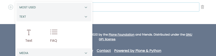
What's left to do? You created a block type with view and edit form and even a nice widget for the editor to fill in questions and answers. Register the block type and you are good to start your app and create an FAQ for the conference speakers.

Go to config.js and register your block type.

 1import icon from '@plone/volto/icons/list-bullet.svg';
 2
 3import FAQBlockEdit from './FAQ/BlockEdit';
 4import FAQBlockView from './FAQ/BlockView';
 5import FAQListEditWidget from './FAQ/FAQListEditWidget';
 6
 7export default function applyConfig(config) {
 8  config.blocks.blocksConfig.faq_viewer = {
 9    id: 'faq_viewer',
10    title: 'FAQ',
11    edit: FAQBlockEdit,
12    view: FAQBlockView,
13    icon: icon,
14    group: 'text',
15    restricted: false,
16    mostUsed: false,
17    sidebarTab: 1,
18    security: {
19      addPermission: [],
20      view: [],
21    },
22  };
23
24  config.widgets.type.faqlist = FAQListEditWidget;
25
26  return config;
27}

As we now apply our configuration of the new block type, the app is enriched with an accordion block.

index.js

1import applyConfig from './config';
2
3export default applyConfig;

Run

yarn start
@rohberg/volto-accordion-block

See the complete add-on code @rohberg/volto-accordion-block [1]

29.1. Save your work to Github#

Your add-on is ready to use. As by now your repository is on Github. As long as it is published, you can share it with others.

A Volto project uses this add-on via 'mrs.developer' [2]

Install mrs.developer to let the project know about the source of your add-on.

yarn add mrs-developer -WD

The configuration file mrs.developer.json instructs mrs.developer from where it has to pull the package. So, create mrs.developer.json and add:

{
    "greenthumb-volto-custom-addon": {
        "package": "volto-custom-addon",
        "url": "git@github.com:greenthumb/volto-custom-addon.git",
        "path": "src"
    }
}

Run

make develop

An official release is done on npm. Switch to section Release a Volto add-on.