Blocks schema and variations#
In the previous chapter we just replaced or enhanced our View component by directly mutating the View in the Blocks engine. Now since all the blocks in principle should be schema based and should use BlockDataForm we do have another concept of extending Blocks with respect to schema.
The BlockDataForm renders a schemaEnhanced form ready to be used along with the variations support.
The variations are various "View" mode options that your block might have whether its layout, the designs or a completely enhanced form of a block.
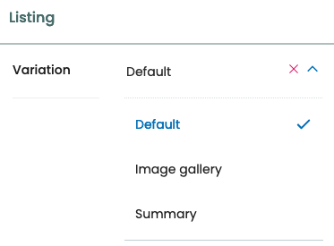
You may know the variations from the listing-block already:
To create a new variation we don't need to shadow or customize the block.
So in the default schema for teaser block we have:
 teaser: {
    id: 'teaser',
    title: 'Teaser',
    icon: imagesSVG,
    group: 'common',
    view: TeaserViewBlock,
    edit: TeaserEditBlock,
    restricted: false,
    mostUsed: true,
    sidebarTab: 1,
    blockSchema: TeaserSchema,
    dataAdapter: TeaserBlockDataAdapter,
    variations: [
      {
        id: 'default',
        isDefault: true,
        title: 'Default',
        template: TeaserBlockDefaultBody,
      },
    ],
  },
Notice the variations key, in which we can have multiple view templates for a given block. Right now its going to use the default one which is the TeaserBlockDefaultBody.
We are going to create a new variation of this teaser block. This variation is essential because using it we will create block extensions per teaser. Later we can also enhance this variation with the new schema.
Go ahead and extend the in the variations key of the teaser-block in index.js like this:
import TeaserBlockImageVariation from "volto-teaser-tutorial/components/TeaserBlockImageVariation";

const applyConfig = (config) => {
  // ...
  config.blocks.blocksConfig.teaser.variations = [
    ...config.blocks.blocksConfig.teaser.variations,
    {
      id: "image-top-variation",
      title: "Image(Top) variation",
      template: TeaserBlockImageVariation,
    },
  ];
  return config;
};

export default applyConfig;
We should create this view template in our components/TeaserBlockImageVariation.jsx
TeaserBlockImageVariation.jsx:
import React from "react";
import PropTypes from "prop-types";
import { Message } from "semantic-ui-react";
import { defineMessages, useIntl } from "react-intl";

import imageBlockSVG from "@plone/volto/components/manage/Blocks/Image/block-image.svg";

import { flattenToAppURL, isInternalURL } from "@plone/volto/helpers";
import { MaybeWrap } from "@plone/volto/components";
import { formatDate } from "@plone/volto/helpers/Utils/Date";
import { UniversalLink } from "@plone/volto/components";
import cx from "classnames";
import config from "@plone/volto/registry";

const messages = defineMessages({
  PleaseChooseContent: {
    id: "Please choose an existing content as source for this element",
    defaultMessage:
      "Please choose an existing content as source for this element",
  },
});

const DefaultImage = (props) => <img {...props} alt={props.alt || ""} />;

const TeaserBlockImageDefault = (props) => {
  const { className, data, isEditMode } = props;
  const locale = config.settings.dateLocale || "en";
  const intl = useIntl();
  const href = data.href?.[0];
  const image = data.preview_image?.[0];
  const align = data?.styles?.align;

  const Image = config.getComponent("Image").component || DefaultImage;
  const { openExternalLinkInNewTab } = config.settings;

  return (
    <div className={cx("block teaser", className)}>
      <>
        {!href && isEditMode && (
          <Message>
            <div className="teaser-item placeholder">
              <img src={imageBlockSVG} alt="" />
              <p>{intl.formatMessage(messages.PleaseChooseContent)}</p>
            </div>
          </Message>
        )}
        {href && (
          <MaybeWrap
            condition={!isEditMode}
            as={UniversalLink}
            href={href["@id"]}
            target={
              data.openLinkInNewTab ||
              (openExternalLinkInNewTab && !isInternalURL(href["@id"]))
                ? "_blank"
                : null
            }
          >
            <div className="teaser-item default">
              {(href.hasPreviewImage || href.image_field || image) && (
                <div className="image-wrapper">
                  <Image
                    item={props["@type"] === "listing" ? null : image || href}
                    src={
                      props["@type"] === "listing"
                        ? addAppURL(`${href}/${image?.download}`)
                        : null
                    }
                    imageField={image ? image.image_field : href.image_field}
                    alt=""
                    loading="lazy"
                    responsive={true}
                  />
                </div>
              )}
              <div className="content">
                {data?.head_title && (
                  <div className="headline">{data.head_title}</div>
                )}
                <h2>{data?.title}</h2>
              </div>
            </div>
          </MaybeWrap>
        )}
      </>
    </div>
  );
};

TeaserBlockImageDefault.propTypes = {
  data: PropTypes.objectOf(PropTypes.any).isRequired,
  isEditMode: PropTypes.bool,
};

export default TeaserBlockImageDefault;
After this you will be able to choose variations for this block from the Blocks Settings sidebar. Right now this variation only shows default variation of Teaser block. You could decide to modify the template here already though. In the coming chapter we are gonna enhance this variation with extension per teaser.
Note
The Body component in Teaser block also supports adding variations from component registry. You can read more about component registry in following chapters.