9. Brief introduction to Volto blocks#
We will use Volto blocks to compose the homepage.
Volto features the Pastanaga Blocks Editor Engine, allowing you to compose a page visually using blocks. The editor allows you to add, modify, reorder and delete blocks. Blocks provide the user the ability to display content in an arbitrary way, although blocks can also define behavior and can have specific features. Blocks are composed of two basic (and required) components: the Block edit and view components.
By default, Volto ships with a basic set of Blocks, including Title, Text, Image, Video, Listing, Search, Table, ToC and Maps.
Note
Volto Blocks are not enabled by default in all Plone content types.
However, the plone.volto package, which comes with a default Plone 6 site enables Blocks for the Document, Event and News Item content types, so you will be able to use Blocks when you create or edit a page.
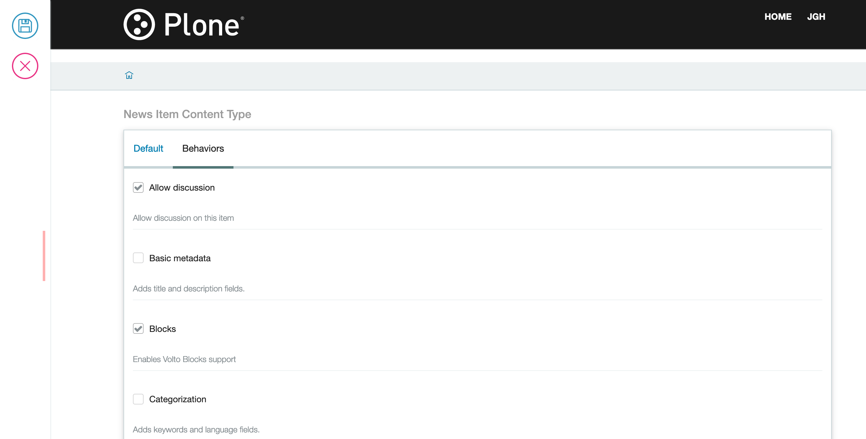
9.1. How to manually enable Blocks on a content type#
There is a behavior called Blocks made available by plone.volto.
To enable it you need to access the types control panel.
There you can choose a content type to edit and enable Blocks in the Behaviors tab.
9.2. Blocks anatomy#
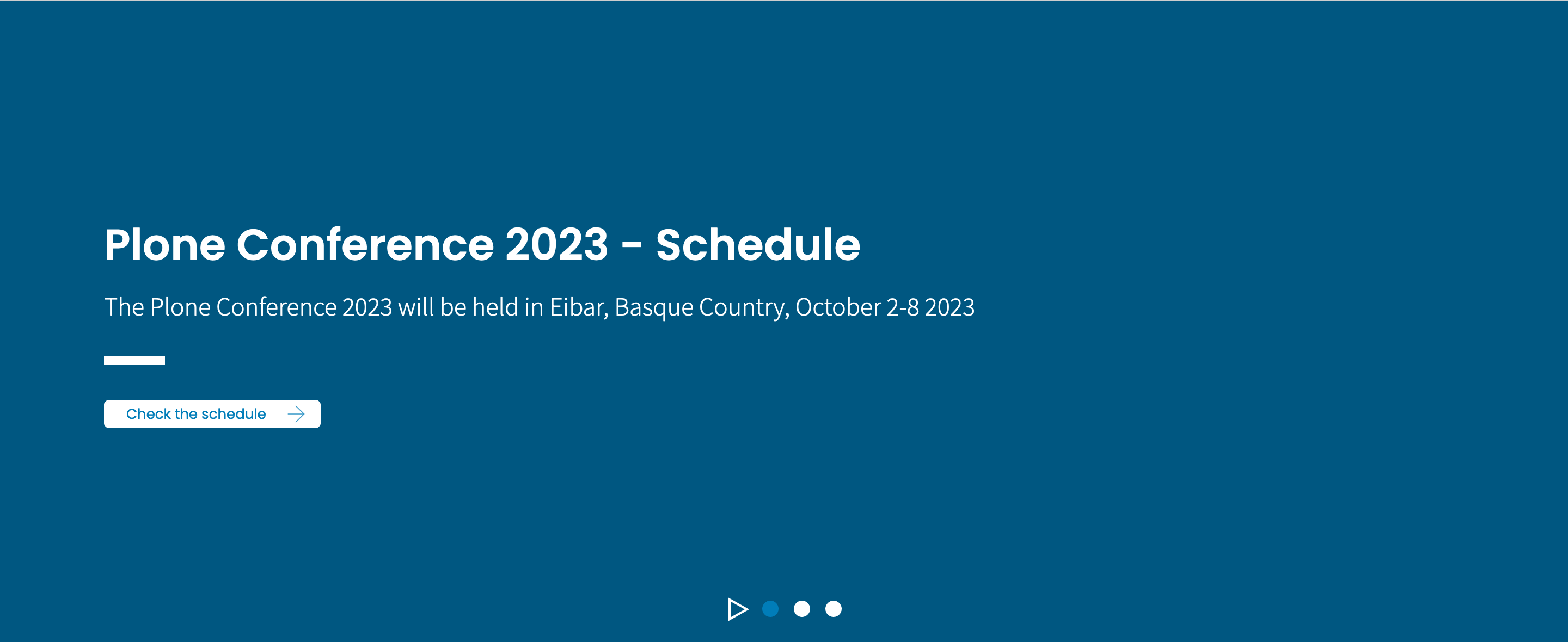
The first Block we will create is the Slider Block at the top of the https://plone.org frontpage.
Every Block is composed of an edit (Edit.jsx) component and a view (View.jsx) component.
Create your first block in the project by adding these two components in a new directory in your addon src/components/Blocks/Slider.
This is the Edit.jsx:
import React from "react";

const Edit = (props) => {
  return <div>I'm the Slider edit component!</div>;
};

export default Edit;
and the View.jsx.
import React from "react";

const View = (props) => {
  return <div>I'm the Slider view component!</div>;
};

export default View;
9.2.1. Block view component props#
The view component of a block receives these props (properties) from the Blocks Engine:
id - the unique ID for the current block
properties - the current content
data - the data of the block (stored in the block itself)
You can use them to render the view component.
9.2.2. Block edit component props#
The edit component of a block receives a quite high number props from the Blocks Engine. Some of the most useful are these:
type - the type of the block
id - the unique ID for the current block
data - the data of the block (stored in the block itself)
selected - (Bool) true if the block is currently selected
index - the block index order in the list of blocks
pathname - the current URL pathname
You can use all these props to render your edit block and model its behavior.
9.3. Register Block Files in index#
To help keeping paths for importing components clean we use index files in several places in Volto projects. In your addon under src/components/ create a new file index.js which serves as a library from where we late can easily import all our components without having to rmemeber all of their paths. In there we directly export the Block components directly from their respective files.
/src/components/index.js
import SliderBlockEdit from "./Blocks/Slider/Edit";
import SliderBlockView from "./Blocks/Slider/View";

export { SliderBlockEdit, SliderBlockView };
9.4. Blocks settings#
We need to configure the project to make it aware of a new block by adding it to the object configuration for that we need the 2 blocks components we created and a svg icon that will be displayed in the blocks chooser. This will again be done in the projects config file:
import { SliderBlockView, SliderBlockEdit } from "./components/";
import heroSVG from "@plone/volto/icons/hero.svg";
Register it inside the applyConfig() function:
config.blocks.blocksConfig.slider = {
  id: "slider",
  title: "Slider",
  icon: heroSVG,
  group: "common",
  view: SliderBlockView,
  edit: SliderBlockEdit,
  restricted: false,
  mostUsed: true,
  sidebarTab: 1,
};
Your new block should be ready to use in the editor.