12. Grid listing Variation#
One of the most used blocks in Volto is the listing block. It allows editors to automatically list contents on a page that fit a certain criteria (e.g. all pages of a specific content type). To always display content in the most visually useful way (you might want a list of upcoming events look different to a list of the latest projects of your company) the listing has the possibility to appear in different visual variations. In vanilla Plone 6 those are the default, summary and image gallery variation. To learn how to create a new listing variation we will recreate the Plone latest News listing from underneath the slider.
12.1. create some dummy events to display#
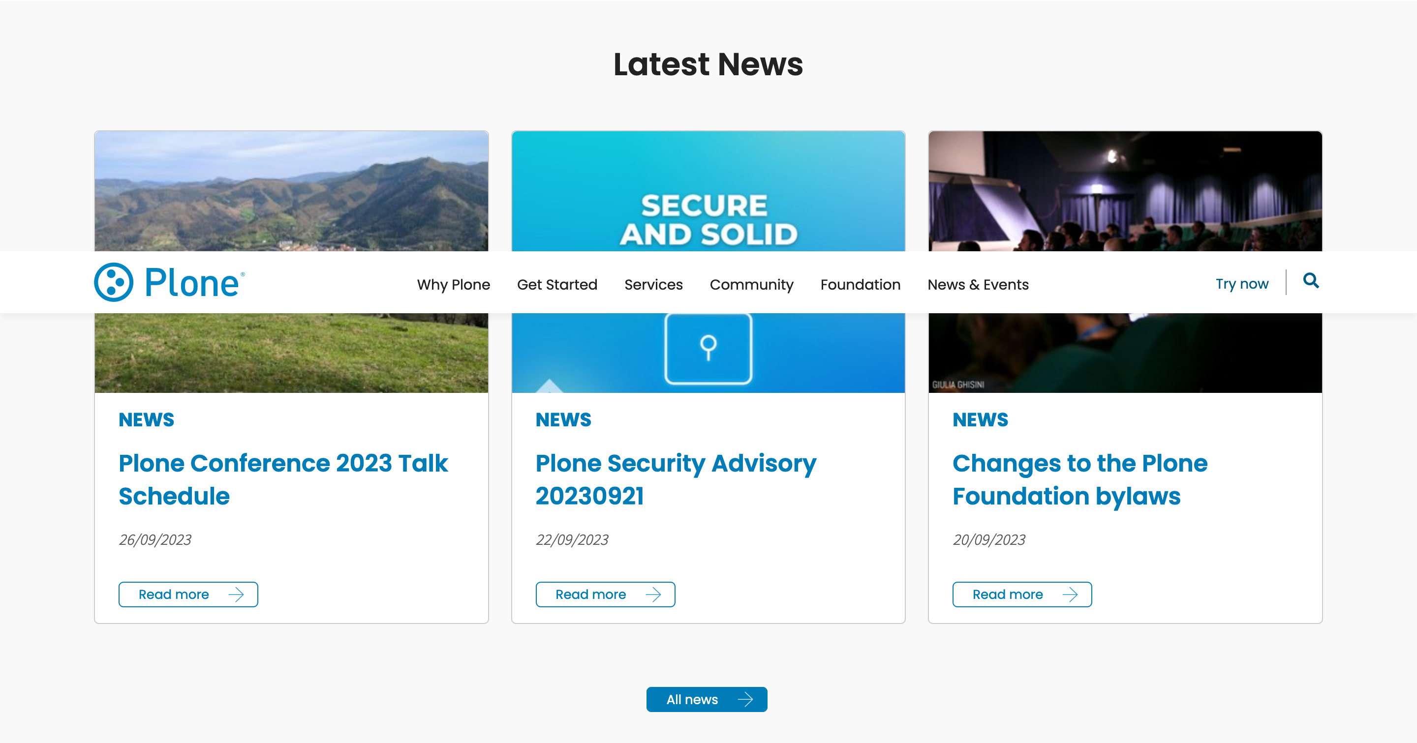
At the moment of writing this training there are three latest news on display in that Block:
Plone Conference 2023 Talk Schedule - 26/09/2023
Plone Security Advisory 20230921 - 22/09/2023
Changes to the Plone Foundation bylaws - 20/09/2023
Create these inside of your "News and Events" Page in your training site. You can already add a listing Block on your frontpage and configure it to display the latest three news items by setting the following:
Headline: "Latest News"
Criteria "Type" : "News Item"
Sort on "Effective date" and "Reversed order"
"Results limit": 3
The listing Block should now show you the 3 News Items.
12.2. create the actual variation#
Inside of your components/Blocks/ directory create a new folder called listing and in there a file ListingGridVariation.jsx. Before we create the proper variation we will first create a simple mock like this:
const ListingGridVariation = (props) => {
    const { items } = props;
    console.log(items)
  return (
    <div>
      {items.map((item) => (
        <ul>
          <li>{item.title}</li>
        </ul>
      ))}
    </div>
  );
};

export default ListingGridVariation;
Export the component from the components/index.js as you already did with the Block View components and import it to your addons config index.js:
import {
  HighlightBlockView,
  HighlightBlockEdit,
  DownloadLinkBlockEdit,
  DownloadLinkBlockView,
  ListingGridVariation,
} from './components'
After that you can add your variation to the list of available listing variations by adding this to the applyConfig function:
config.blocks.blocksConfig.listing.variations = [
  ...config.blocks.blocksConfig.listing.variations,
  {
    id: "listingGrid",
    title: "Grid",
    template: ListingGridVariation,
  },
];
This should be enough to show make the "Grid" variation choosable when adding a listing Block. Choose your new variation in the "Variation" field in the edit menu of the Block
12.3. Markup for the Grid#
To style the variation, replace the code from ListingGridVariation.jsx with:
import { Container, Grid, Card, Image } from 'semantic-ui-react';
import Moment from 'moment';
import { UniversalLink, Icon } from '@plone/volto/components';
import ArrowRightSVG from '@plone/volto/icons/ahead.svg';

const ListingGridVariation = (props) => {
  const { items } = props;

  return (
    <div className="listing-grid">
      <Container>
        <Grid stackable columns={3}>
          <Grid.Row>
            {items.map((item) => (
              <Grid.Column>
                <Card className="news-card">
                  {item.image_scales && (
                    <Image
                      src={`${item['@id']}/${item.image_scales.image[0].scales.preview.download}`}
                    />
                  )}
                  <Card.Content>
                    <div className="news-card-subtitle">News</div>
                    <h3>
                      <UniversalLink href={item['@id']}>
                        {item.title}
                      </UniversalLink>
                    </h3>
                    <p className="date">
                      {Moment(item.Date).format('DD/MM/YYYY')}
                    </p>
                    <UniversalLink
                      className="news-card-button"
                      href={item['@id']}
                    >
                      <span>Read more</span>
                      <Icon name={ArrowRightSVG} size={16} />
                    </UniversalLink>
                  </Card.Content>
                </Card>
              </Grid.Column>
            ))}
          </Grid.Row>
        </Grid>
      </Container>
    </div>
  );
};

export default ListingGridVariation;
Note that the moment js is used here format the dates of the news items. This is the default library used in Volto for date formatting.
To finish the styling, now add this provided CSS to your custom.overrides:
// Grid Listing
.block.listing.listingGrid {
  font-family: 'Helvetica';
  h2 {
    font-size: 2rem;
    font-weight: bold;
    text-align: center;
  }
  .listing-grid {
    .ui.card {
      width: 100%;

      img {
        height: 260px;
        object-fit: cover;
        object-position: center center;
      }
      .content {
        .news-card-subtitle {
          color: @blue;
          font-size: 1.2rem;
          font-weight: 700;
          margin-bottom: 1rem;
        }
        h3 {
          color: @blue;
          font-size: 1.5rem;
          font-weight: 700;
          margin-top: 0;
          padding-right: 1rem;
          &:hover {
            text-decoration: underline;
          }
        }
        .date {
          margin-bottom: 2rem;
        }
        .news-card-button {
          font-family: 'Helvetica';
          border: 1px solid @blue;
          color: @blue;
          padding: 4px 20px;
          border-radius: 5px;
          font-size: 13px;
          line-height: 15px;
          display: inline-flex;
          align-items: center;

          .icon {
            margin-left: 1.5em;
          }
          &:hover {
            color: @white;
            background: @blue;
          }
        }
      }
    }
  }
}