3. Create a theme based on Barceloneta#
We’re going to create a theme for Plone 6 Classic UI that is based on the default theme plonetheme.barceloneta.
This package will allow you to change and extend the look of Plone to your needs. You will develop on the filesystem. You can add your package to any code repository e.g. GitHub and re-use it on different Plone sites.
Use Case
Your own theme package based on Plone Classic Theming
You want to have control over all styles
You want to build on existing Plone Core or Addon Templates and Markup
What you will learn
How to prepare your development setup
How to create your theme package
What are the important parts of your theme
How to add and compile your styles
3.1. Creating a theme package#
To create a filesystem based theme, we first create a new addon package for Plone type:
$ plonecli create addon myaddon.name
Answer some questions about the package:
--> Author's name [Your Name]:

--> Author's email [yourname@example.com]:

--> Author's GitHub username: your_name_gitbhub

--> Package description [An add-on for Plone]:

--> Do you want me to initialize a GIT repository in your new package?

--> Plone version [6.0]:

--> Python version for virtualenv [python3]:

--> Do you want me to activate VS Code support? (y/n) [y]:

Generated file structure at ... ./myaddon.name
Change into your package:
$ cd myaddon.name
To create a theme based on Plones default theme Barceloneta, add theme_barceloneta from the list of templates.
$ plonecli add theme_barceloneta
You will be asked for to name your theme (This will be the name that is displayed in the theming control panel and can but does not have to be the package name):
--> Theme name [My Theme]:

Generated file structure at ... ./myaddon.name
All theme related files have now been added to ./myaddon.name/src/myaddon/name/theme/
./myaddon.name/src/myaddon/name/theme/
├── barceloneta-apple-touch-icon-114x114-precomposed.png
├── barceloneta-apple-touch-icon-144x144-precomposed.png
├── barceloneta-apple-touch-icon-57x57-precomposed.png
├── barceloneta-apple-touch-icon-72x72-precomposed.png
├── barceloneta-apple-touch-icon-precomposed.png
├── barceloneta-apple-touch-icon.png
├── barceloneta-favicon.ico
├── index.html
├── manifest.cfg
├── package.json
├── preview.png
├── rules.xml
├── styles
│   ├── theme.css
│   ├── theme.min.css
│   └── theme.scss
└── tinymce-templates
    ├── README.rst
    ├── card-group.html
    └── list.html
3.2. Run your theme package#
Within the base directory of your package ./myaddon.name run plonecli buildto get all necessary packages to run Plone.
$ plonecli build
After that you can start your Plone site with:
$ plonecli serve

[...]

Serving on http://0.0.0.0:8080
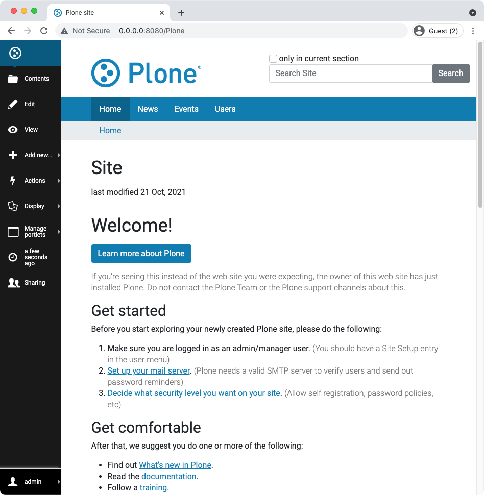
Open http://localhost:8080 in a Browser and see that Plone is running.
Click Create Classic Plone site and enter admin for Username and also for Password
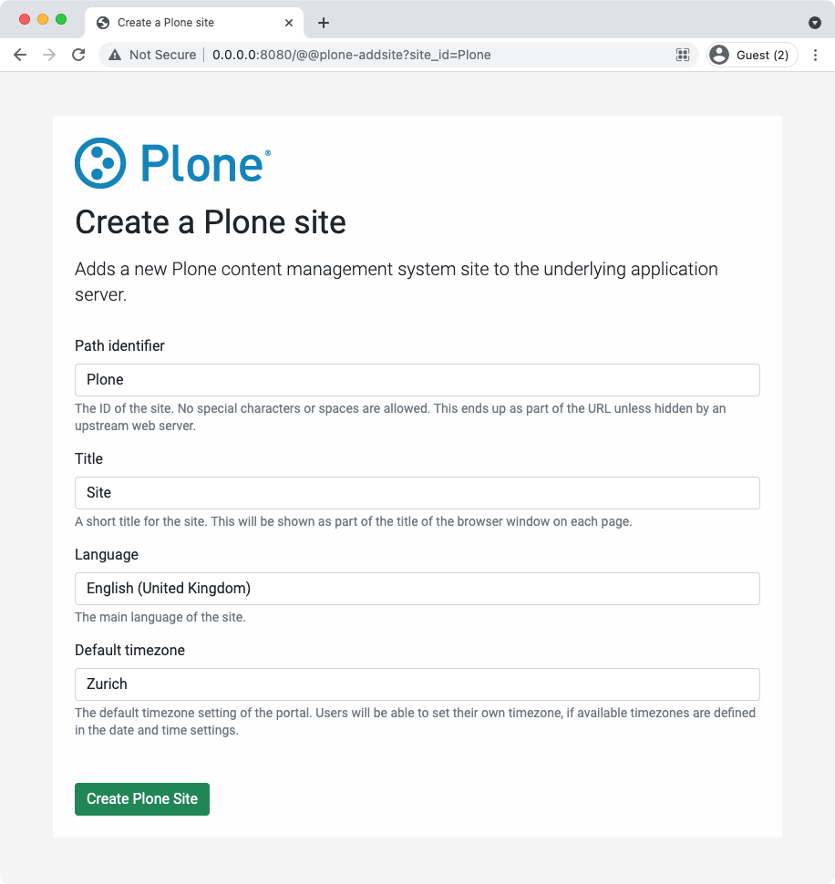
Click Create Plone Site to complete the setup of your Plone instance.
To enable your theme
Go to the Plone Control Panel:
Go to the "Add-ons" control panel.
You will see this form:
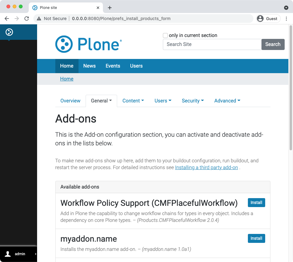
Click Install to enable your addon package and theme
3.3. Compiling Styles#
Open a new terminal and change into the theme folder of your package:
$ cd myaddon.name/src/myaddon/name/theme/
The package.json file defines dependencies for the theme and includes scripts to compile the theme.scss to theme.css and a production optimized theme.min.css.
{
  "//": "Put here only theme dependencies, devDependencies should stay outside of the theme folder in the package root.",
  "name": "my-theme",
  "version": "1.0.0",
  "license": "MIT",
  "devDependencies": {
    "autoprefixer": "^10.2.5",
    "bootstrap": "^5.1.1",
    "clean-css-cli": "^5.3.0",
    "nodemon": "^2.0.7",
    "npm-run-all": "^4.1.5",
    "postcss": "^8.2.15",
    "postcss-cli": "^8.3.1",
    "sass": "^1.32.13",
    "stylelint-config-twbs-bootstrap": "^2.2.0"
  },
  "scripts": {
    "watch": "nodemon --watch styles/ --ext scss --exec \"npm run css-main\"",
    "build": "npm-run-all css-compile-main css-prefix-main css-minify-main",
    "css-main": "npm-run-all css-compile-main css-prefix-main css-minify-main",
    "css-compile-main": "sass --load-path=node_modules --style expanded --source-map --embed-sources --no-error-css styles/theme.scss:styles/theme.css",
    "css-prefix-main": "postcss --config postcss.config.js --replace \"styles/*.css\" \"!styles/*.min.css\"",
    "css-minify-main": "cleancss -O1 --format breakWith=lf --with-rebase --source-map --source-map-inline-sources --output styles/theme.min.css styles/theme.css",
    "css-lint": "stylelint \"styles/**/*.scss\" --cache --cache-location .cache/.stylelintcache"
  },
  "dependencies": {
    "@plone/plonetheme-barceloneta-base": "^3.0.0-alpha5"
  }
}
Install theme dependencies
$ npm install
To compile your styles and watch for changes while developing run
$ npm run watch
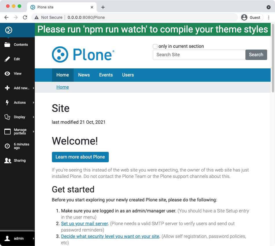
If you visit your browser again, the green placeholder should be gone and you're ready to add your own styles.
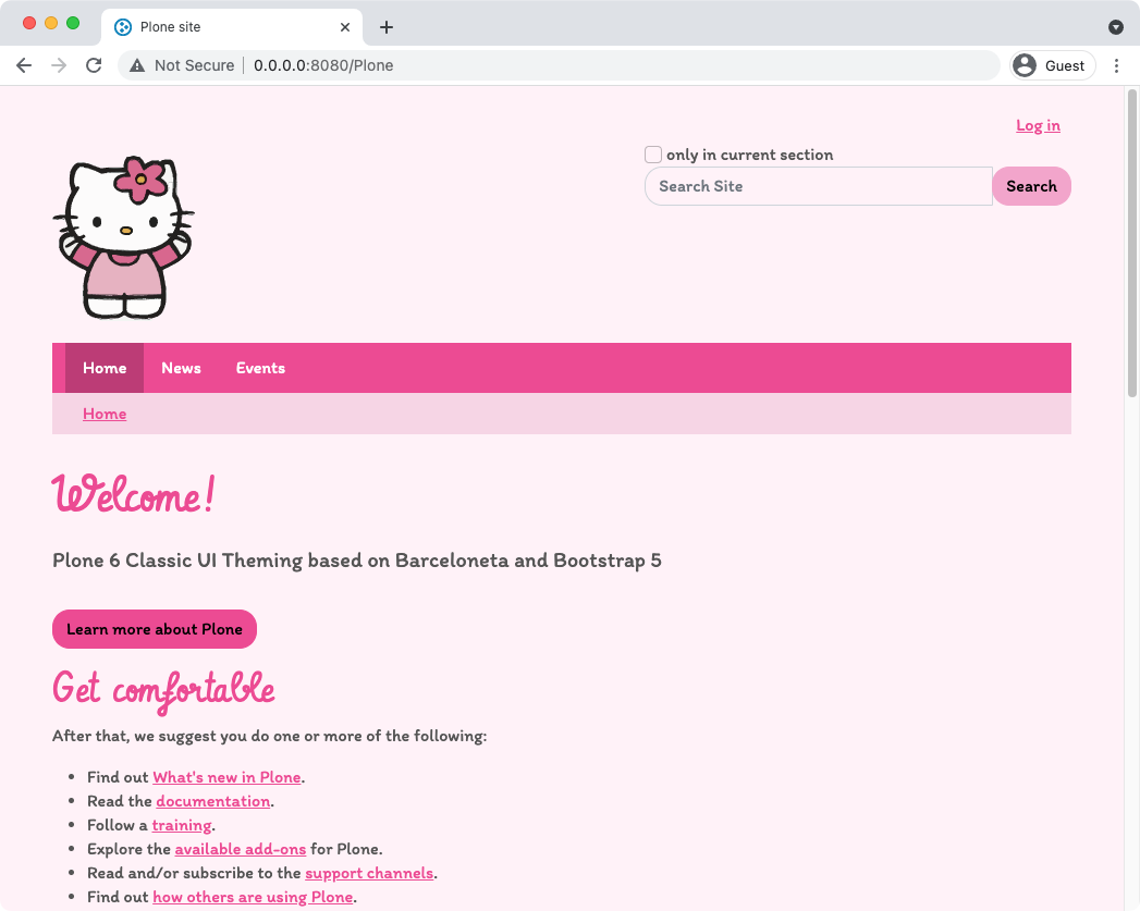
3.4. Working with Bootstrap variables#
In this example we will be recreating plonetheme.gruuezibuesi you can find it collective/plonetheme.grueezibuesi for reference.
An awesome looking theme often is based on the colors that the site logo offers. So go ahead and add a logo as explained in TTW Customizations.
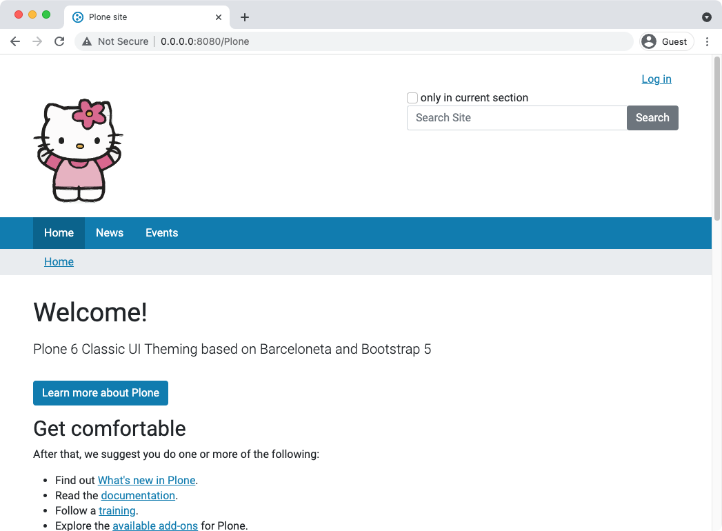
Now you have some colors that you will use throughout your theme. And to use them throughout every aspect of the theme, we're doing this using variables.
Bootstrap offers tons of variables that allow you to change every aspect of the theme without writing any extra styles yourself.
We have overall properties like shadows, gradients, rounded corners or generic variables for things like colors, sizes, fonts and variables for very detailed aspects like the inner padding of your buttons or fields.
Within the styles folder of your theme you find theme.scss. This is the base file for the compilation of your styles.
  1// Theme import structure is based on Bootstrap documentation
  2// https://getbootstrap.com/docs/5.2/customize/sass/#importing
  3
  4// Barceloneta and Bootstrap import are using --load-path=node_modules
  5
  6// Roboto is not included in this template and therefore we disable the setup here.
  7$enable-roboto-webfont: false !default;
  8
  9// 1. Include functions first (so you can manipulate colors, SVGs, calc, etc)
 10@import "bootstrap/scss/functions";
 11
 12// 2. Include any default variable overrides here
 13
 14$pink: #EE4793;
 15$light-pink: #F3A4CB;
 16$lighter-pink: #f7d4e5;
 17$lightest-pink: #fff2f8;
 18$medium-grey: #555;
 19
 20$primary: $pink;
 21$secondary: $light-pink;
 22
 23
 24// 3. Include remainder of required Barceloneta and Bootstrap stylesheets
 25@import "@plone/plonetheme-barceloneta-base/scss/variables.colors.plone";
 26@import "@plone/plonetheme-barceloneta-base/scss/variables.properties";
 27@import "@plone/plonetheme-barceloneta-base/scss/variables.barceloneta";
 28@import "bootstrap/scss/variables";
 29
 30// 4. Include any default map overrides here
 31
 32// 5. Include remainder of required parts
 33@import "bootstrap/scss/maps";
 34@import "bootstrap/scss/mixins";
 35@import "bootstrap/scss/root";
 36@import "@plone/plonetheme-barceloneta-base/scss/mixins/mixin.portlets.plone";
 37@import "@plone/plonetheme-barceloneta-base/scss/mixins/mixin.font.plone";
 38@import "@plone/plonetheme-barceloneta-base/scss/root_variables";
 39
 40// 6. Bootstrap base parts as needed
 41@import "bootstrap/scss/utilities";
 42@import "bootstrap/scss/reboot";
 43@import "bootstrap/scss/type";
 44@import "bootstrap/scss/images";
 45@import "bootstrap/scss/containers";
 46@import "bootstrap/scss/grid";
 47@import "bootstrap/scss/helpers";
 48
 49// 7. Bootstrap components
 50@import "bootstrap/scss/tables";
 51@import "bootstrap/scss/forms";
 52@import "bootstrap/scss/buttons";
 53@import "bootstrap/scss/transitions";
 54@import "bootstrap/scss/dropdown";
 55@import "bootstrap/scss/button-group";
 56@import "bootstrap/scss/nav";
 57@import "bootstrap/scss/navbar";
 58@import "bootstrap/scss/card";
 59@import "bootstrap/scss/accordion";
 60@import "bootstrap/scss/breadcrumb";
 61@import "bootstrap/scss/pagination";
 62@import "bootstrap/scss/badge";
 63@import "bootstrap/scss/alert";
 64@import "bootstrap/scss/progress";
 65@import "bootstrap/scss/list-group";
 66@import "bootstrap/scss/close";
 67@import "bootstrap/scss/toasts";
 68@import "bootstrap/scss/modal";
 69@import "bootstrap/scss/tooltip";
 70@import "bootstrap/scss/popover";
 71@import "bootstrap/scss/carousel";
 72@import "bootstrap/scss/spinners";
 73@import "bootstrap/scss/offcanvas";
 74@import "bootstrap/scss/placeholders";
 75
 76// 8. Optionally include utilities API last to generate classes based on the Sass map in `_utilities.scss`
 77@import "bootstrap/scss/utilities/api";
 78
 79// 9. Barceloneta base
 80@import "@plone/plonetheme-barceloneta-base/scss/alerts";
 81@import "@plone/plonetheme-barceloneta-base/scss/forms";
 82@import "@plone/plonetheme-barceloneta-base/scss/controlpanels";
 83@import "@plone/plonetheme-barceloneta-base/scss/login";
 84@import "@plone/plonetheme-barceloneta-base/scss/toolbar";
 85@import "@plone/plonetheme-barceloneta-base/scss/grid";
 86@import "@plone/plonetheme-barceloneta-base/scss/content_base";
 87@import "@plone/plonetheme-barceloneta-base/scss/content_tables";
 88
 89// Barceloneta full
 90@import "@plone/plonetheme-barceloneta-base/scss/cards";
 91@import "@plone/plonetheme-barceloneta-base/scss/scaffolding";
 92@import "@plone/plonetheme-barceloneta-base/scss/icons";
 93@import "@plone/plonetheme-barceloneta-base/scss/header";
 94@import "@plone/plonetheme-barceloneta-base/scss/sitenav";
 95@import "@plone/plonetheme-barceloneta-base/scss/breadcrumbs";
 96@import "@plone/plonetheme-barceloneta-base/scss/content";
 97@import "@plone/plonetheme-barceloneta-base/scss/comments";
 98@import "@plone/plonetheme-barceloneta-base/scss/portlets";
 99@import "@plone/plonetheme-barceloneta-base/scss/footer";
100
101@import "@plone/plonetheme-barceloneta-base/scss/print";
102
103// @import "@plone/plonetheme-barceloneta-base/scss/roboto-webfont";
104
105
106// 9. Add additional custom code here
To make your colors and other variables work, it is important to define them before @import.
We add some colors and map those colors to $primary and $secondary variables that Bootstap uses.
 1// 2. Include any default variable overrides here
 2
 3$pink: #EE4793;
 4$light-pink: #F3A4CB;
 5$lighter-pink: #f7d4e5;
 6$lightest-pink: #fff2f8;
 7$medium-grey: #555;
 8
 9$primary: $pink;
10$secondary: $light-pink;
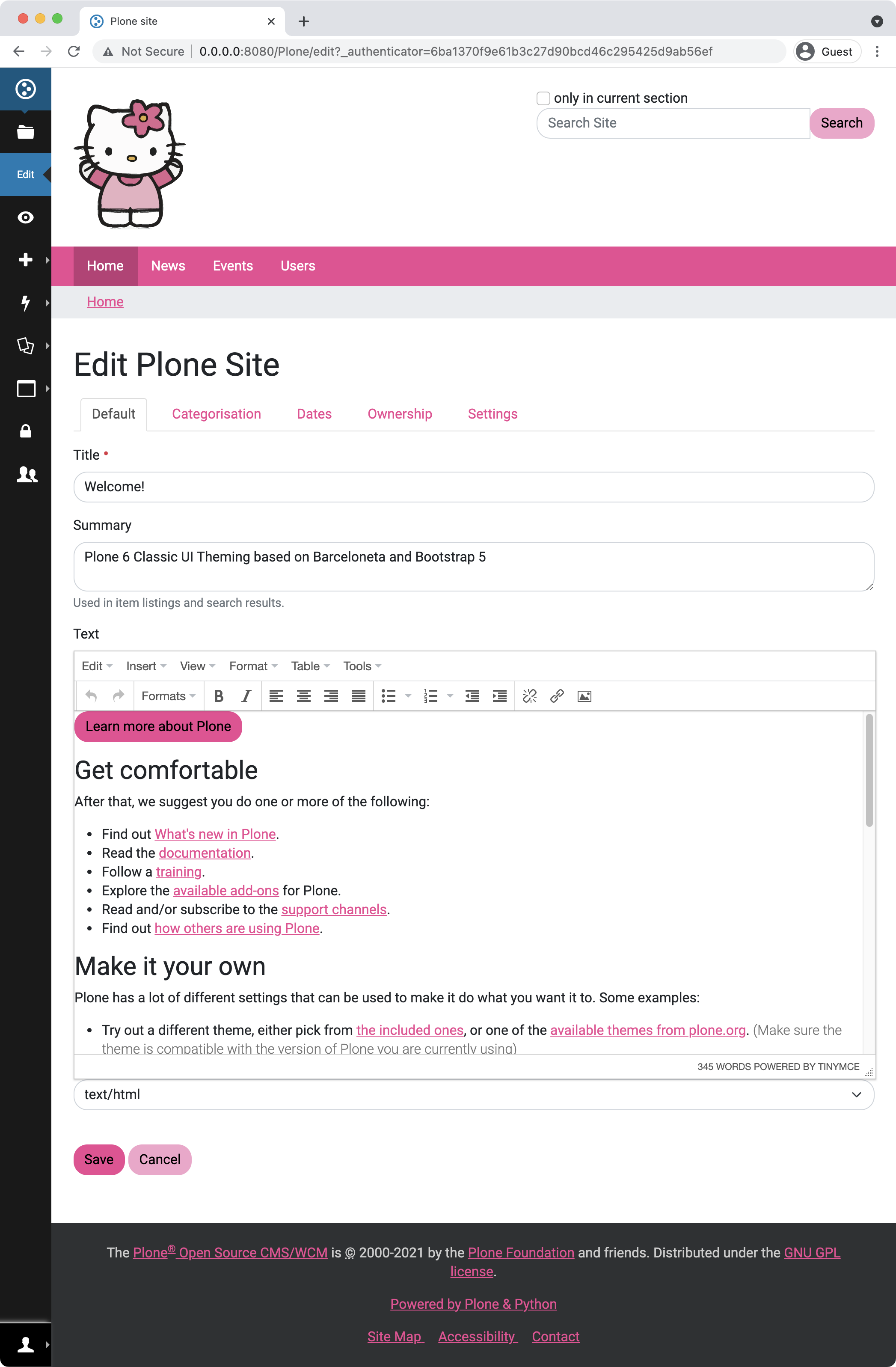
One of the overall properties for the theme is $enable-rounded, add it and change the $border-radius too.
 1//// VARIABLES
 2// ... add your variables here
 3$pink: #EE4793;
 4$light-pink: #F3A4CB;
 5$lighter-pink: #f7d4e5;
 6$lightest-pink: #fff2f8;
 7$medium-grey: #555;
 8
 9$primary: $pink;
10$secondary: $light-pink;
11
12$enable-rounded: true;
13$border-radius: 1rem;
14
15//// IMPORTS
16// Import barceloneta files from node_modules --load-path=node_modules
17@import "@plone/plonetheme-barceloneta-base/scss/barceloneta.scss";
18
19//// STYLES
20// ... add your styles here
Let's change some more variables and set $body-bg and $breadcrumb-bg
 1//// VARIABLES
 2// ... add your variables here
 3$pink: #EE4793;
 4$light-pink: #F3A4CB;
 5$lighter-pink: #f7d4e5;
 6$lightest-pink: #fff2f8;
 7$medium-grey: #555;
 8
 9$primary: $pink;
10$secondary: $light-pink;
11
12$enable-rounded: true;
13$border-radius: 1rem;
14
15$body-bg: $lightest-pink;
16$breadcrumb-bg: $lighter-pink;
17
18//// IMPORTS
19// Import barceloneta files from node_modules --load-path=node_modules
20@import "@plone/plonetheme-barceloneta-base/scss/barceloneta.scss";
21
22//// STYLES
23// ... add your styles here
3.5. Modifying the theme html#
Not everything has to be done in css. Sometimes it's easier to change the underlying index.html.
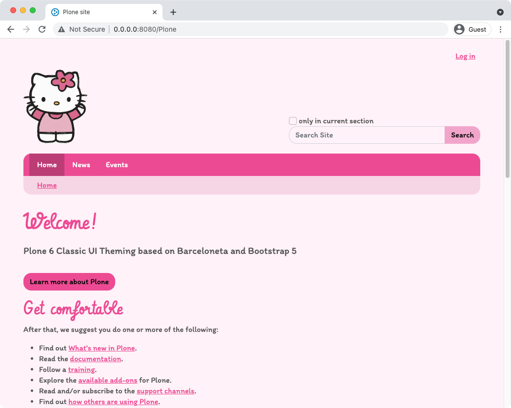
Let's add class="container" from Bootstraps Grid System to id="mainnavigation-wrapper" and id="above-content-wrapper". This will align the width of the main navigation and breadcrumbs to the width of our content.
Just be careful to keep ids used in rules.xml that Diazo can still replace areas in the static html with actual contents.
32  <div id="mainnavigation-wrapper" class="container">
33    <div id="mainnavigation">
34    </div>
35  </div>
36  <div id="hero" class="principal">
37    <div class="container">
38      <div class="gigantic">
39      </div>
40    </div>
41  </div>
42  <div id="above-content-wrapper" class="container">
43      <div id="above-content">
44      </div>
45  </div>
3.6. Fonts#
Fonts are an important visual factor in a theme. To use web fonts we can either link them in the html or @import them within the css.
link
<link rel="preconnect" href="https://fonts.googleapis.com">
<link rel="preconnect" href="https://fonts.gstatic.com" crossorigin>
<link href="https://fonts.googleapis.com/css2?family=Itim&family=Vibur&display=swap" rel="stylesheet">
@import
@import url('https://fonts.googleapis.com/css2?family=Itim&family=Vibur&display=swap');
If you want to see the fonts within TinyMCE as well, you should go with @import. To optimize loading and reduce unwanted effects like web font flashing or flickering it's a good idea to add the rel="preconnect" tags even if you import the fonts in your css.
Let's add those fonts to our css and change the variables to use them.
 1//// VARIABLES
 2// ... add your variables here
 3$pink: #EE4793;
 4$light-pink: #F3A4CB;
 5$lighter-pink: #f7d4e5;
 6$lightest-pink: #fff2f8;
 7$medium-grey: #555;
 8
 9$primary: $pink;
10$secondary: $light-pink;
11
12$enable-rounded:              true;
13$border-radius:               1rem;
14
15$body-bg: $lightest-pink;
16$breadcrumb-bg: $lighter-pink;
17
18
19// Fonts
20@import url('https://fonts.googleapis.com/css2?family=Itim&family=Vibur&display=swap');
21// Fonts - use Import if you want the fonts displayed in TinyMCE as well
22$font-family-sans-serif: Itim, system-ui, -apple-system, "Segoe UI", Roboto, "Helvetica Neue", Arial, sans-serif;
23$headings-font-family: Vibur;
24
25
26//// IMPORTS
27// Import barceloneta files from node_modules --load-path=node_modules
28@import "@plone/plonetheme-barceloneta-base/scss/barceloneta.scss";
29
30
31//// STYLES
32// ... add your styles here

In addition, let's adjust the color and size
 1//// VARIABLES
 2// ... add your variables here
 3$pink: #EE4793;
 4$light-pink: #F3A4CB;
 5$lighter-pink: #f7d4e5;
 6$lightest-pink: #fff2f8;
 7$medium-grey: #555;
 8
 9$primary: $pink;
10$secondary: $light-pink;
11
12$enable-rounded:              true;
13$border-radius:               1rem;
14
15$body-bg: $lightest-pink;
16$breadcrumb-bg: $lighter-pink;
17
18// Fonts
19@import url('https://fonts.googleapis.com/css2?family=Itim&family=Vibur&display=swap');
20// Fonts - use Import if you want the fonts displayed in TinyMCE as well
21$font-family-sans-serif: Itim, system-ui, -apple-system, "Segoe UI", Roboto, "Helvetica Neue", Arial, sans-serif;
22$headings-font-family: Vibur;
23
24// Font colors
25$headings-color: $primary;
26$body-color: $medium-grey;
27
28// Font sizes
29$font-size-base:              1rem;
30$h1-font-size:                $font-size-base * 3;
31$h2-font-size:                $font-size-base * 2.5;
32
33
34//// IMPORTS
35// Import barceloneta files from node_modules --load-path=node_modules
36@import "@plone/plonetheme-barceloneta-base/scss/barceloneta.scss";
37
38
39//// STYLES
40// ... add your styles here
3.7. Styles#
Although we managed to change quite a lot with based on variabless, we still need to write some css to make our theme really pretty. We'll fix the corners of the search, make the main navigation rounded and change the alignment of items within the portal-header.
For these styles it's a good idea to use variables from Bootstrap again to make the consistency of your styles easier. We'll include those styles after the import of Barbeloneta/Bootstrap styles and are able to make use of Bootstraps own mixins and utilities too.
 1//// VARIABLES
 2// ... add your variables here
 3$pink: #EE4793;
 4$light-pink: #F3A4CB;
 5$lighter-pink: #f7d4e5;
 6$lightest-pink: #fff2f8;
 7$medium-grey: #555;
 8
 9$primary: $pink;
10$secondary: $light-pink;
11
12$enable-rounded:              true;
13$border-radius:               1rem;
14
15$body-bg: $lightest-pink;
16$breadcrumb-bg: $lighter-pink;
17
18// Fonts
19@import url('https://fonts.googleapis.com/css2?family=Itim&family=Vibur&display=swap');
20// Fonts - use Import if you want the fonts displayed in TinyMCE as well
21$font-family-sans-serif: Itim, system-ui, -apple-system, "Segoe UI", Roboto, "Helvetica Neue", Arial, sans-serif;
22$headings-font-family: Vibur;
23
24// Font colors
25$headings-color: $primary;
26$body-color: $medium-grey;
27
28// Font sizes
29$font-size-base:              1rem;
30$h1-font-size:                $font-size-base * 3;
31$h2-font-size:                $font-size-base * 2.5;
32
33
34//// IMPORTS
35// Import barceloneta files from node_modules --load-path=node_modules
36@import "@plone/plonetheme-barceloneta-base/scss/barceloneta.scss";
37
38
39//// STYLES
40// ... add your styles here
41
42// Search Button
43.searchButton.btn.btn-secondary {
44    border-radius: 0 $border-radius $border-radius 0;
45}
46
47// Navbar & Breadcrumbs
48.navbar {
49    border-radius: $border-radius $border-radius 0 0;
50}
51
52#portal-breadcrumbs {
53    @include border-bottom-radius($border-radius);
54}
55#portal-header {
56    align-items: end;
57}
3.8. CSS variables#
Bootstrap 5 added support for CSS custom properties (variables). If you want to change any of the :root variables of Bootstrap directly, best thing is to add them at the bottom of your style sheet, since browsers interpret them native, like any other CSS.
1:root {
2--foo: red;
3}
You can also change colors of specific components like this:
1.navbar-barceloneta{
2    --bs-navbar-background: green;
3}
This works event in Theming > "Custom Styles", as it is plain CSS.